Education Mobile App
Step Schools
A clean and intuitive education dashboard designed to simplify school management, student tracking, and administrative tasks.

Project Overview
Step Schools is an integrated educational platform designed to streamline student assessments, exam management, and academic tracking. I designed a mobile-first experience that guides students through practice sessions and formal exams with clear instructions and immediate feedback.
- Role
- Product Designer
- Timeline
- 2 Weeks
- Platform
- iOS · Android
- Industry
- Education / Assessment
- Tools
- Figma, Design Systems, User Research
The Problem
Students were dropped into digital assessments with unclear rules and no feedback, which made practice stressful rather than useful.
- Exam rules and timing were never explained before starting
- No immediate feedback during practice sessions
- Attempted, correct and wrong states were hard to tell apart
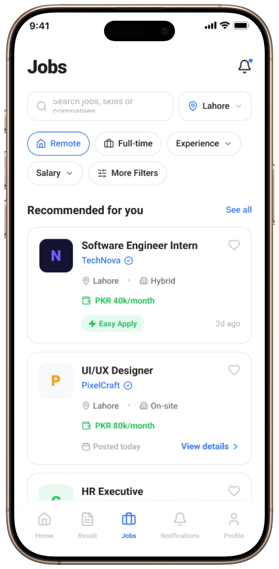
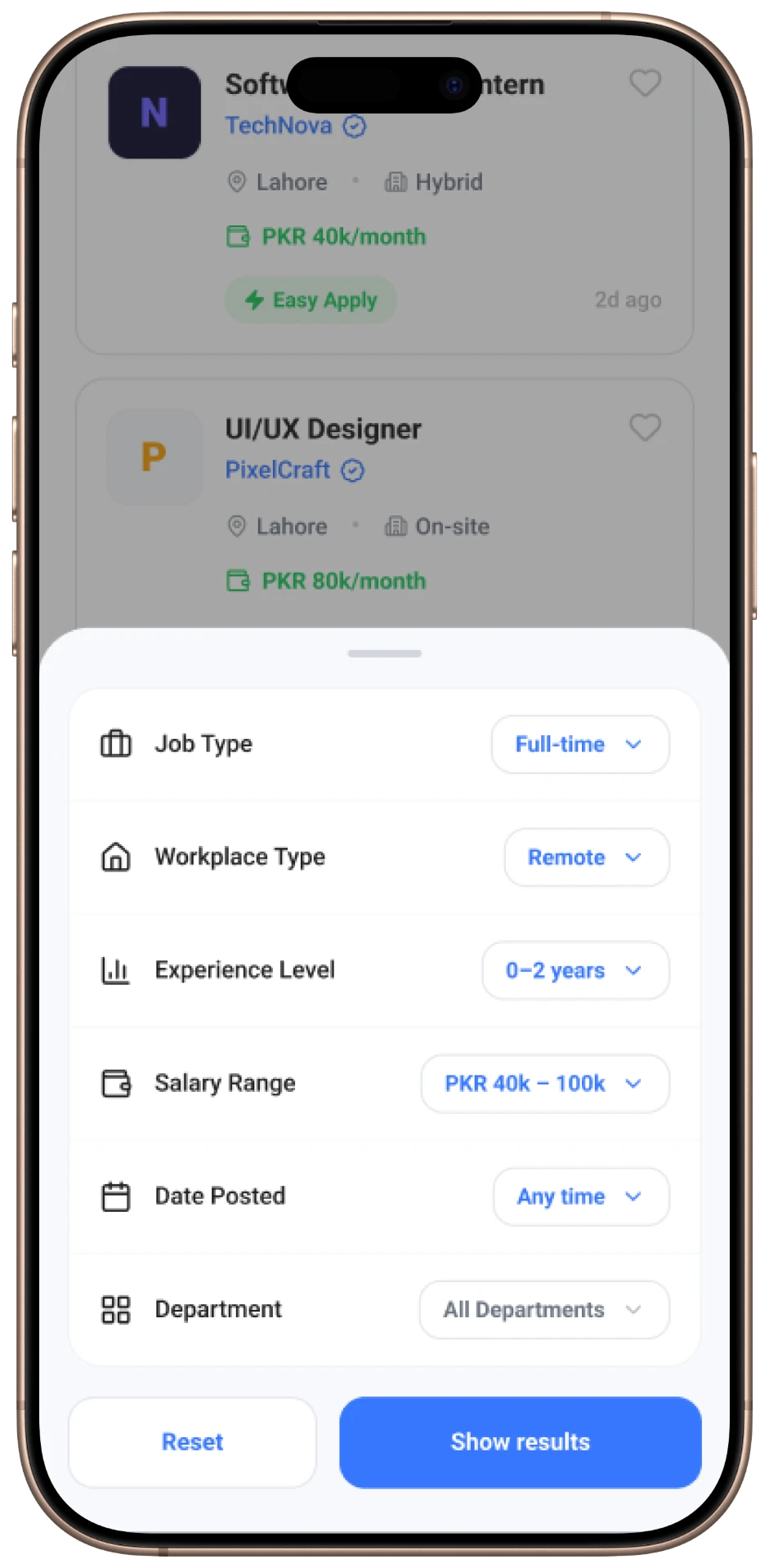
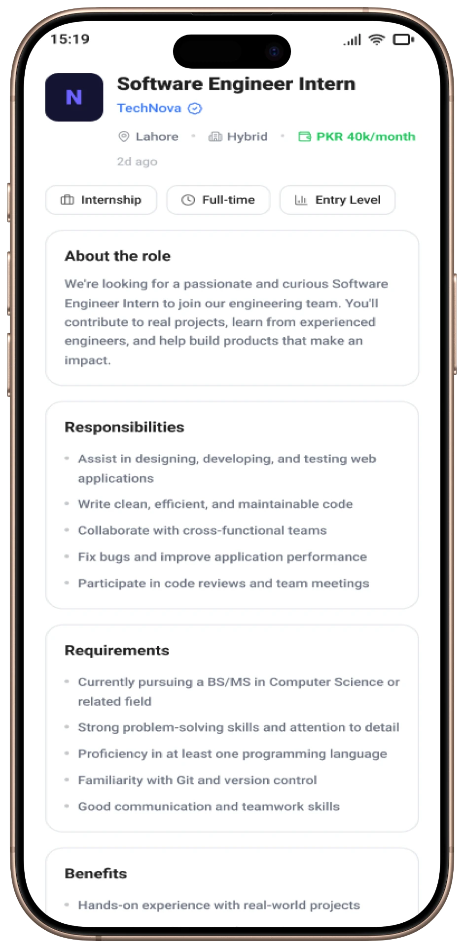
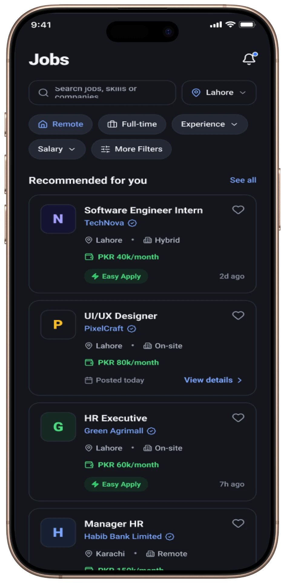
- Jobs, results and profile flows felt like separate products
Project Goals
Create a user-friendly, engaging mobile environment that simplifies the exam process, provides clear instructions, and offers detailed performance insights through structured reviews.
- 01
Reduce exam anxiety with clear instructions before every attempt
- 02
Give instant solution feedback during practice
- 03
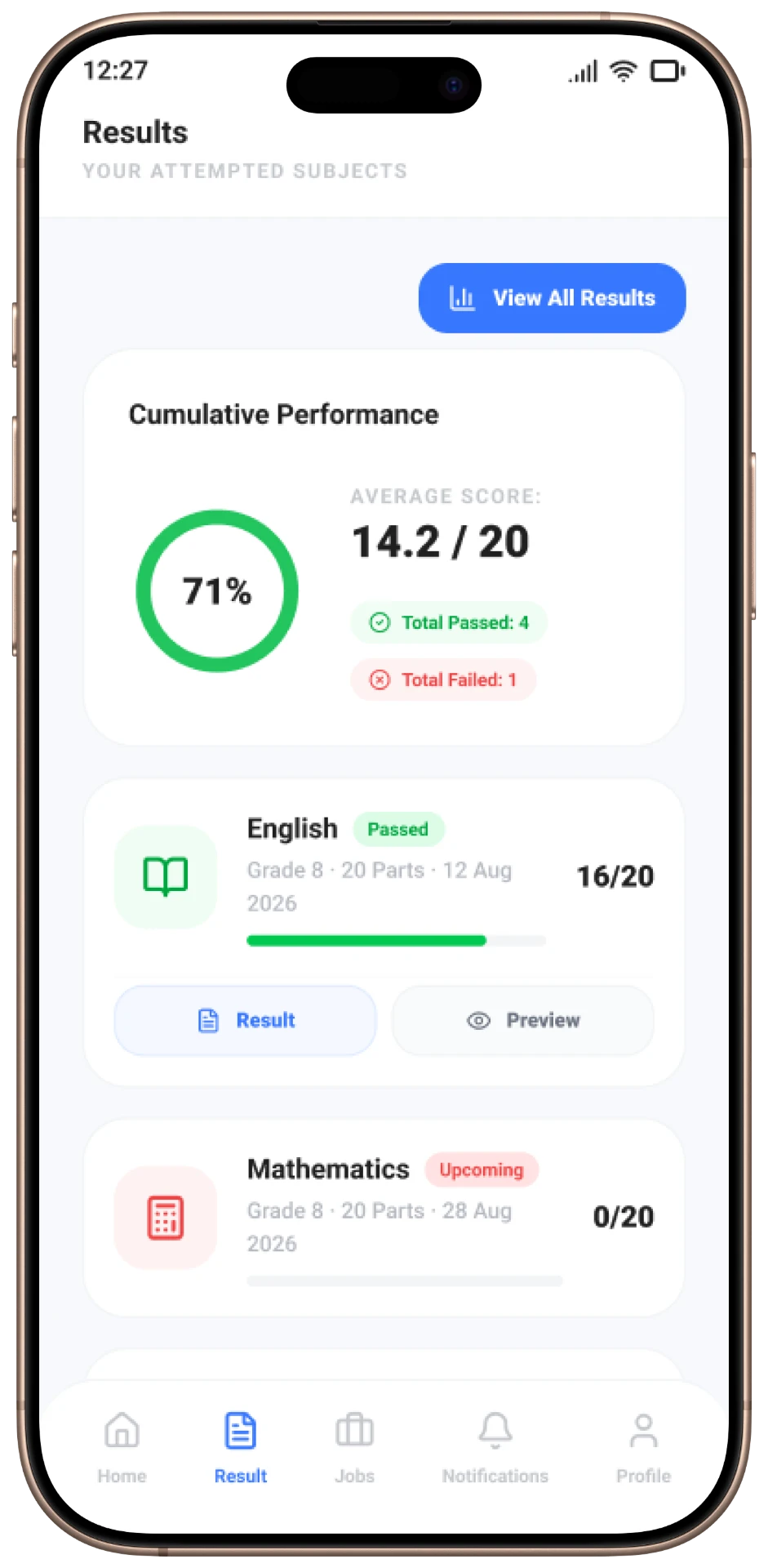
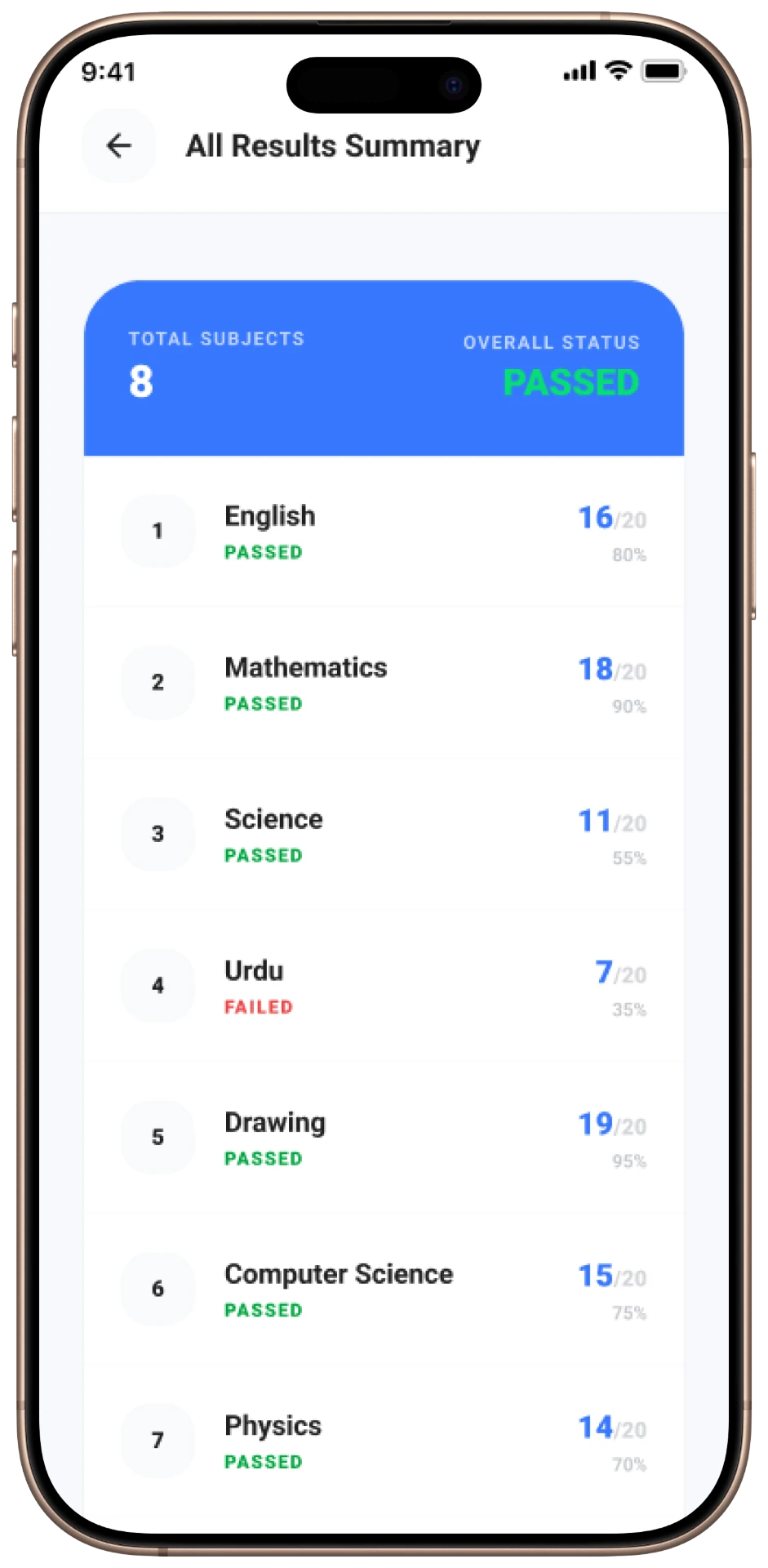
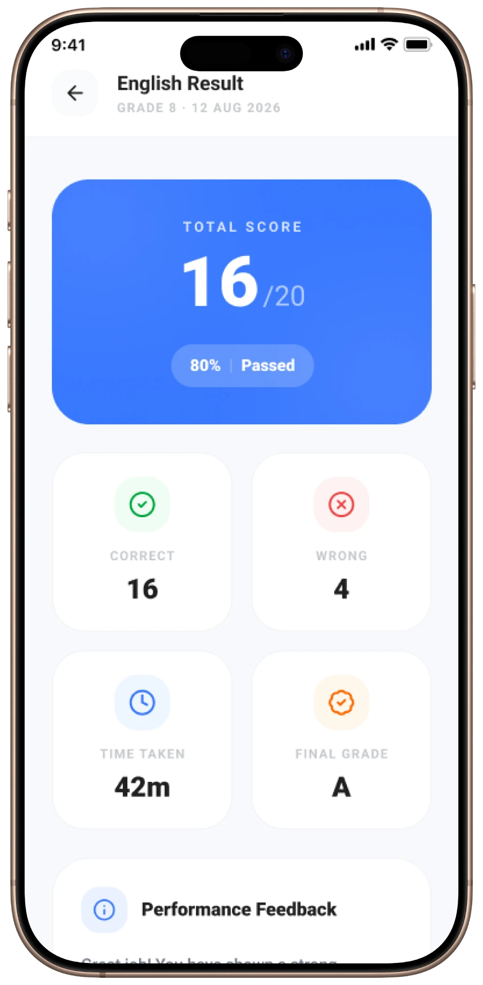
Make performance review visually unambiguous
- 04
Unify assessment, results and job flows in one consistent shell
Research & Discovery
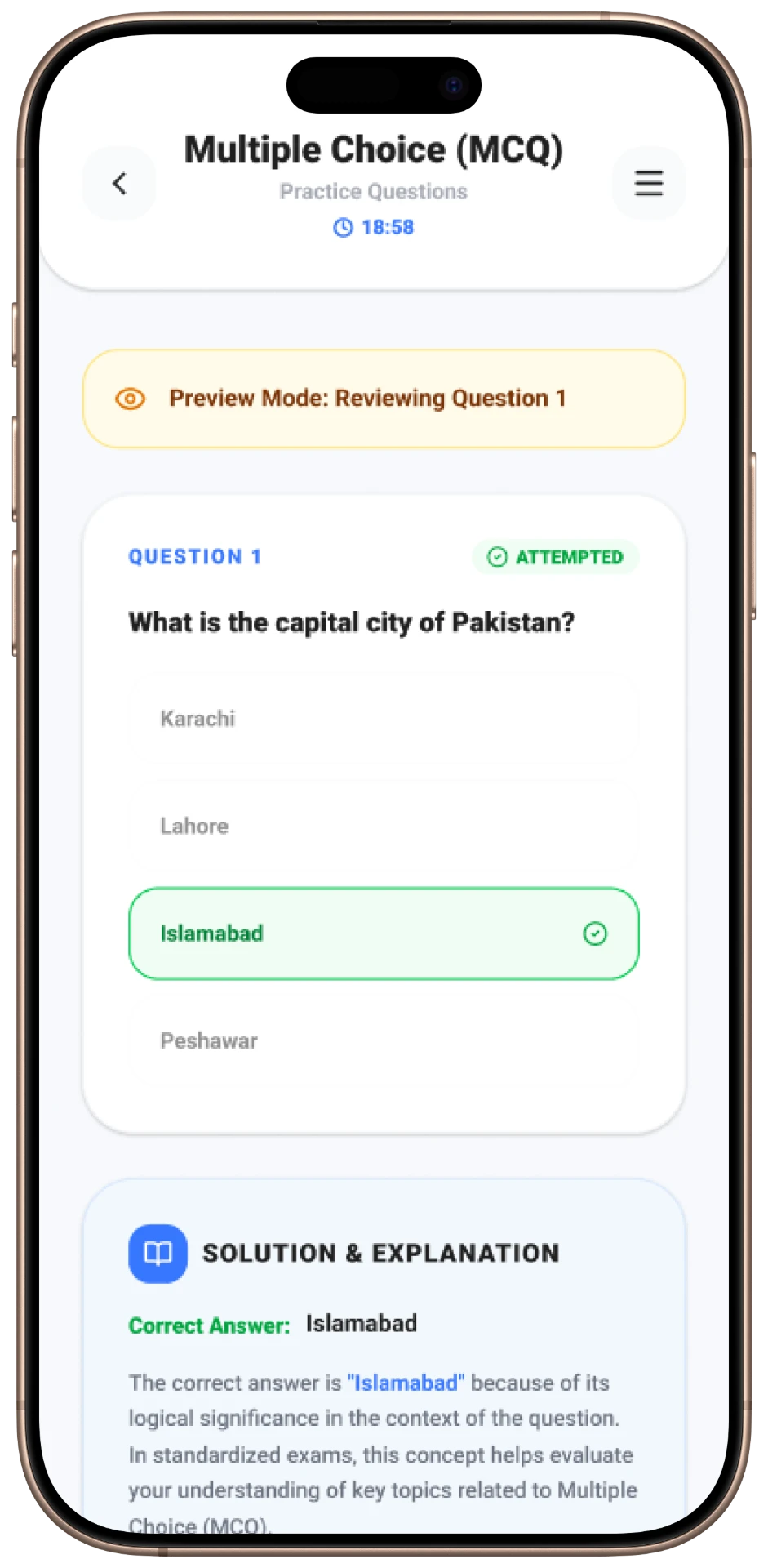
- Students required a flow that reduces exam anxiety through clear 'Exam Instructions' and simple navigation.
- Instant feedback via 'Solution & Explanation' blocks was identified as a key feature for learning during practice sessions.
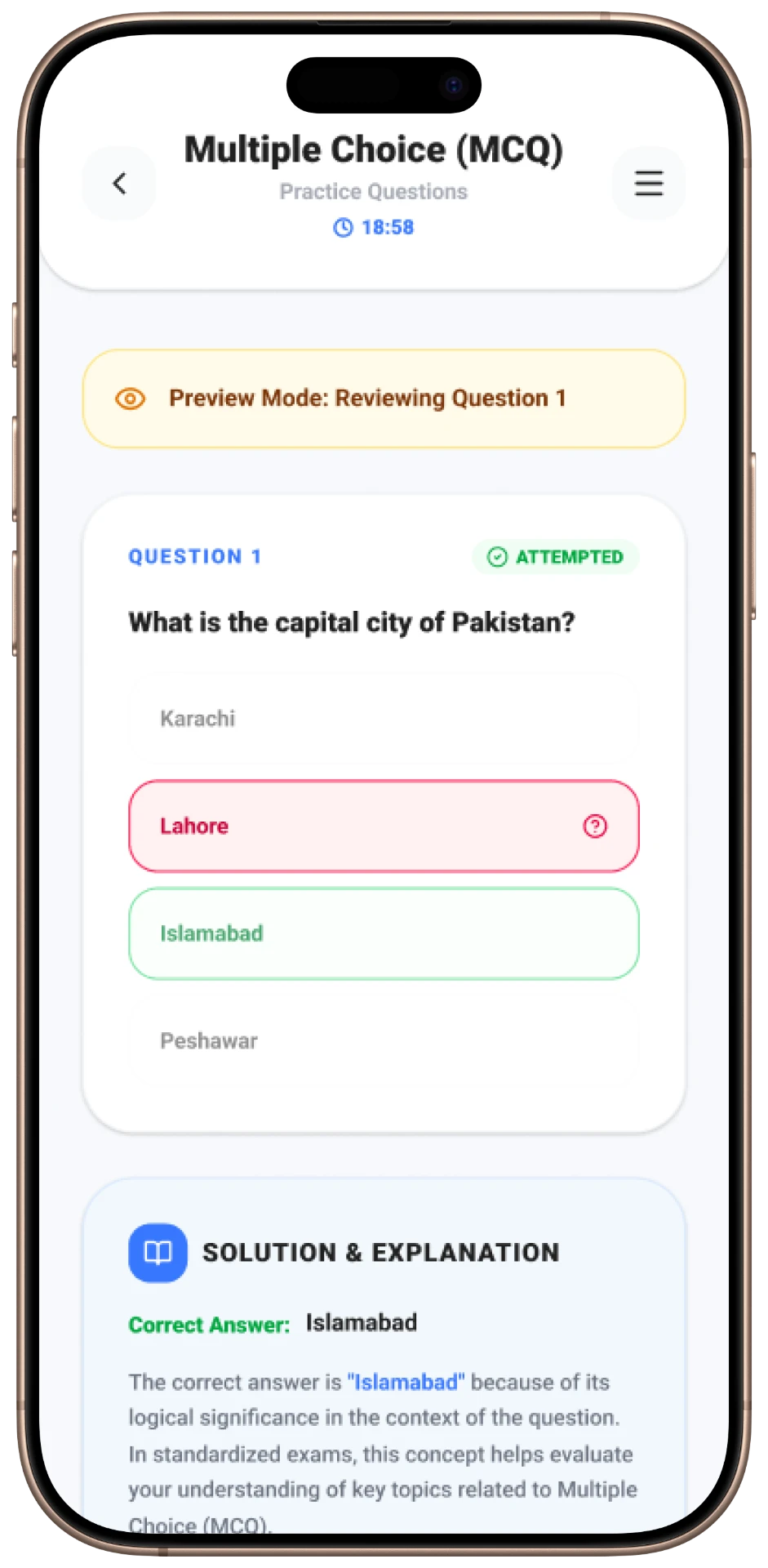
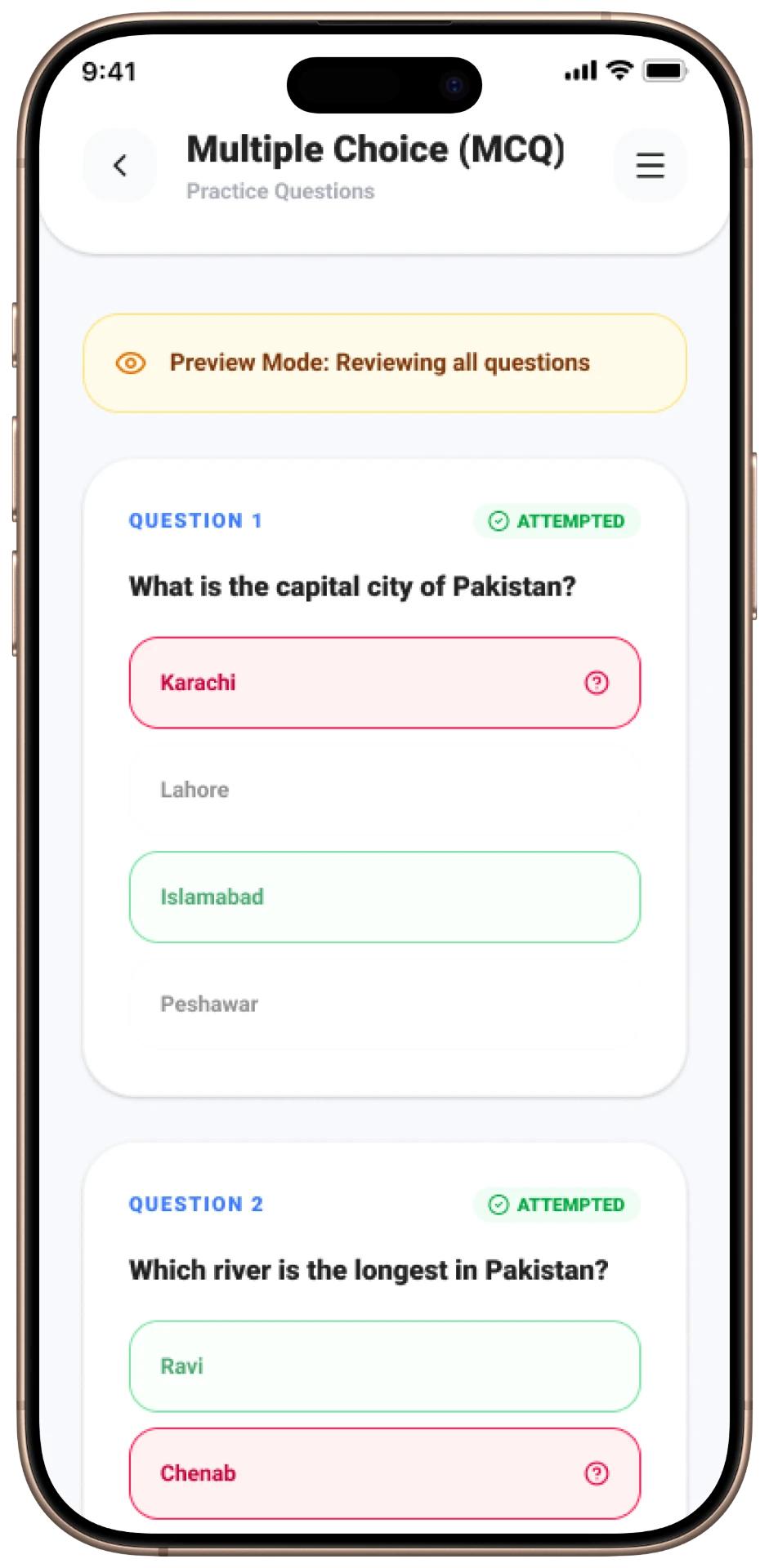
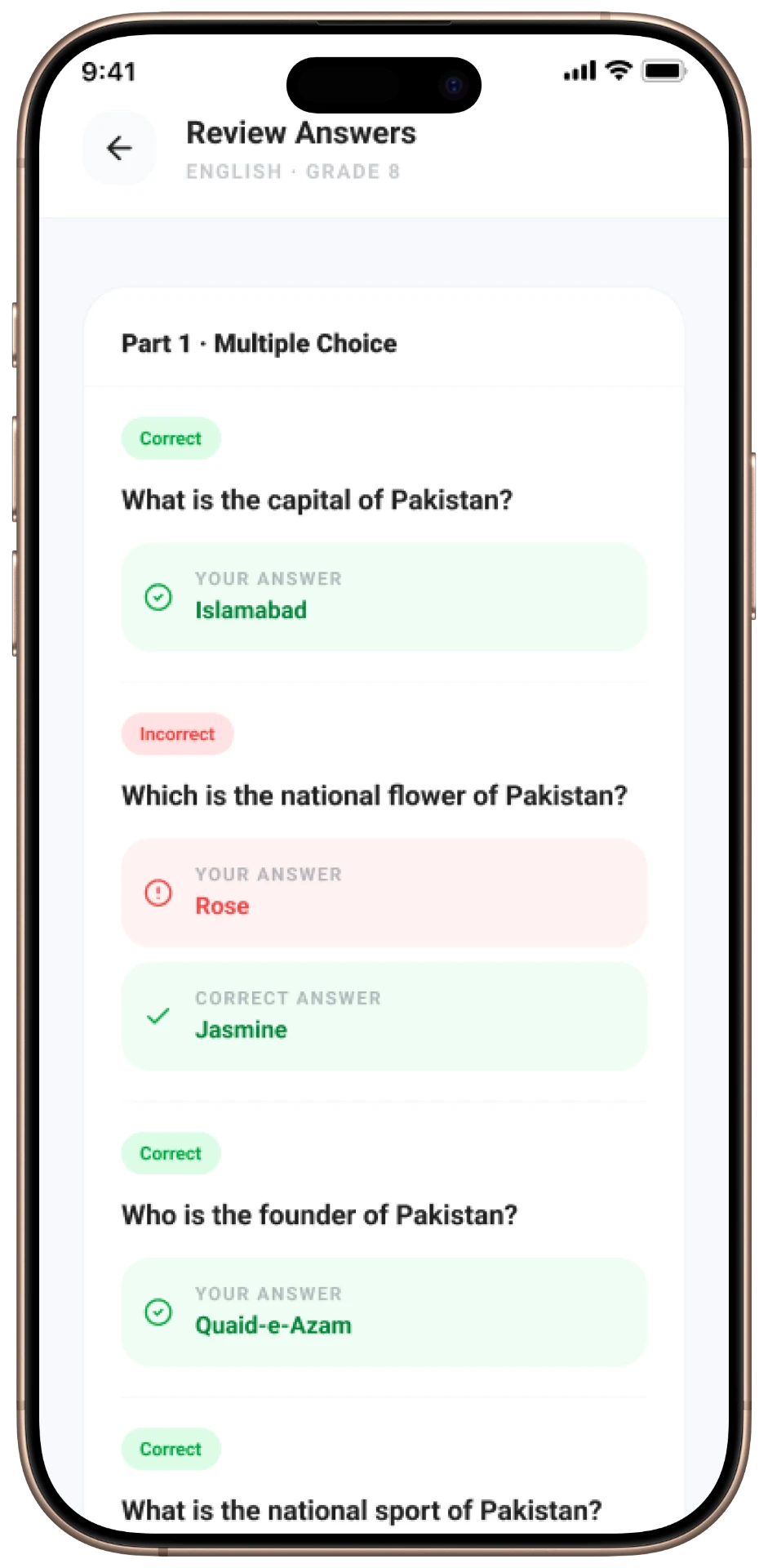
- Visual differentiation between 'Attempted', 'Correct', and 'Wrong' states was critical for the review phase.
User Flow
- Login
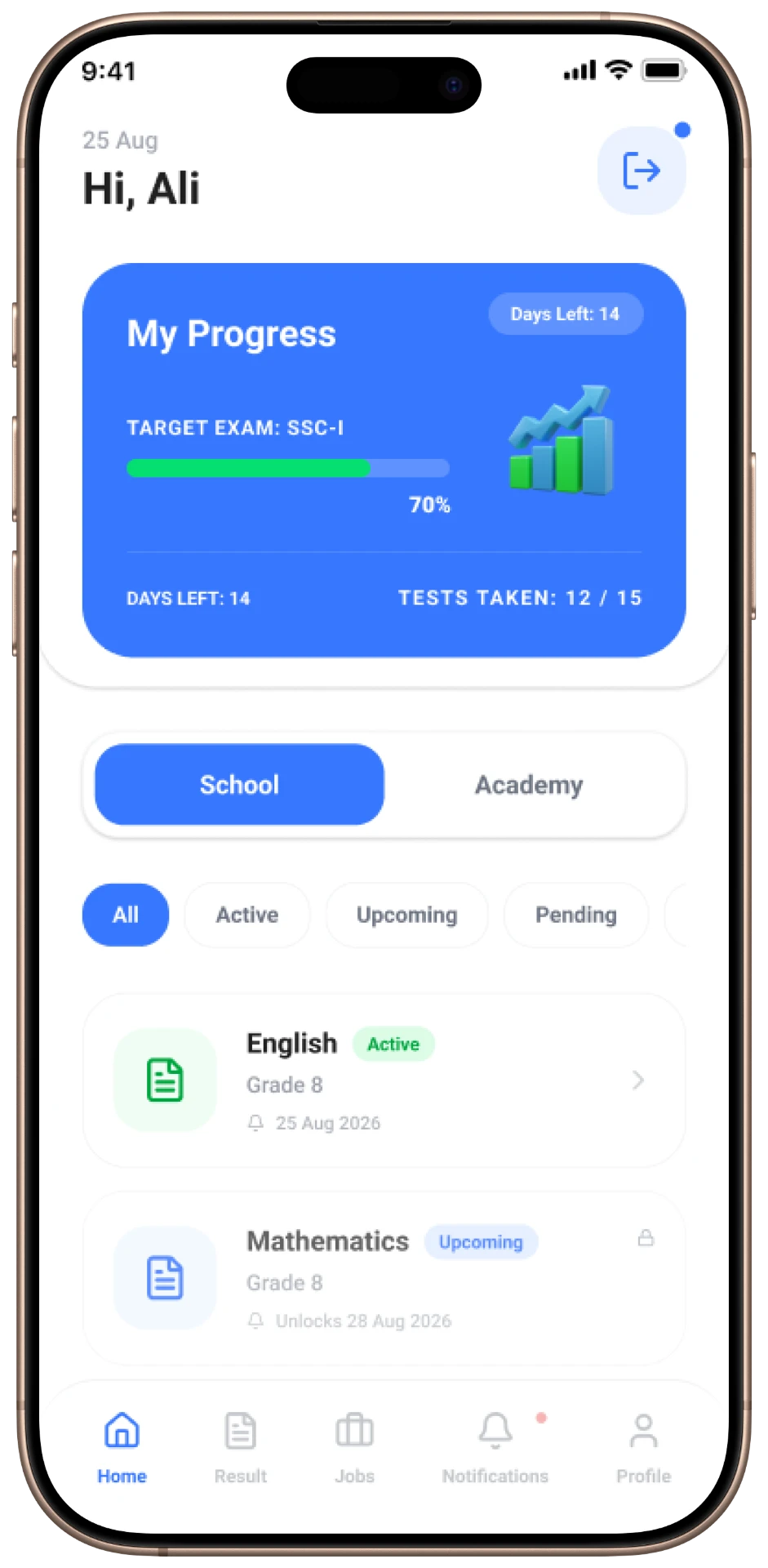
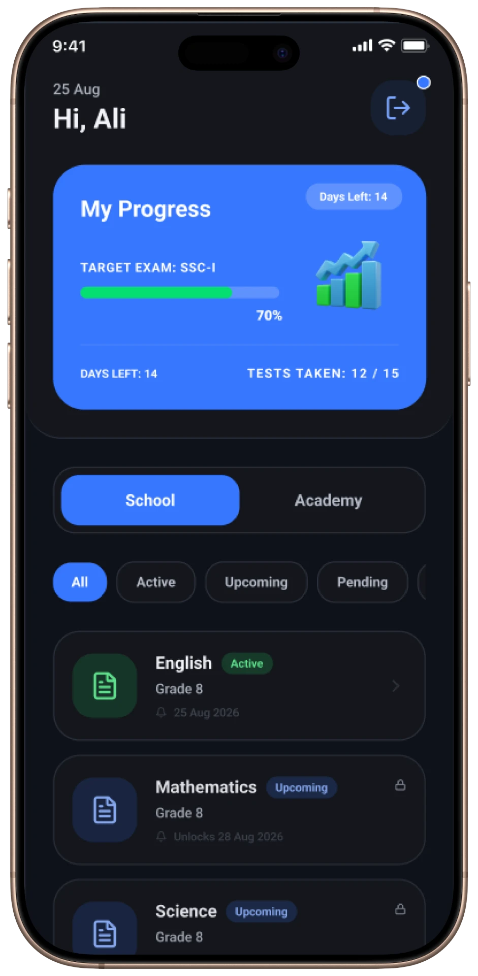
- Home / Dashboard
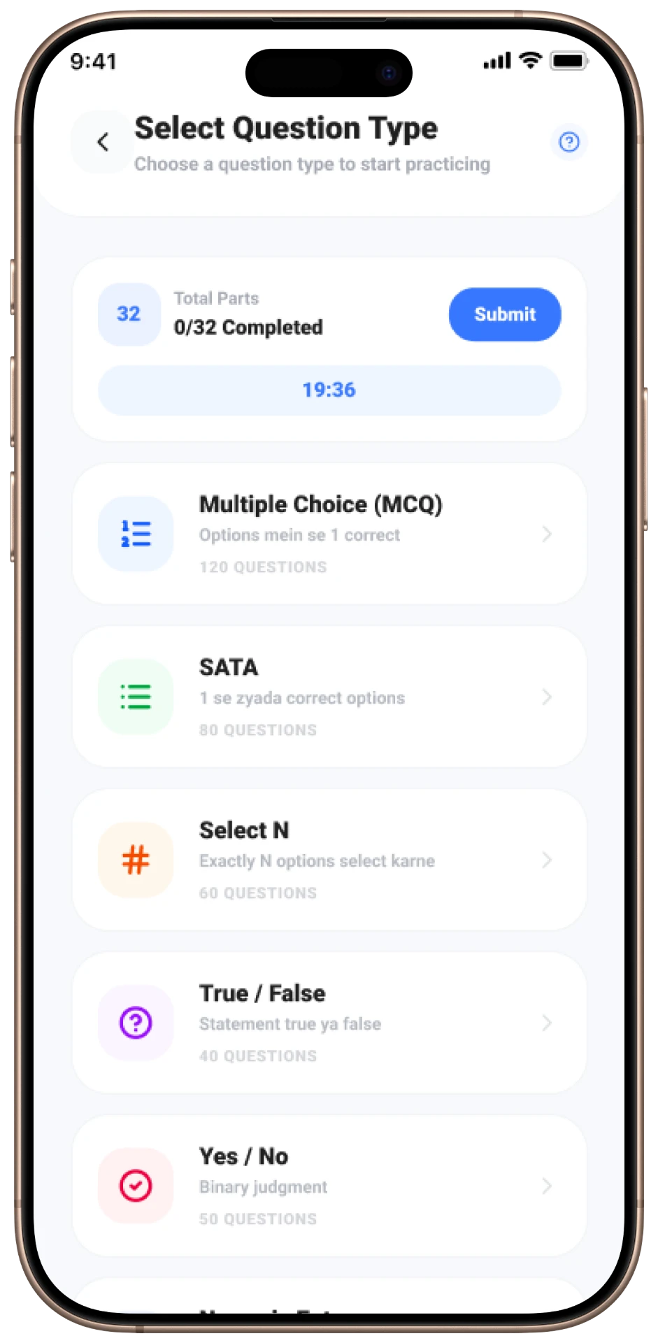
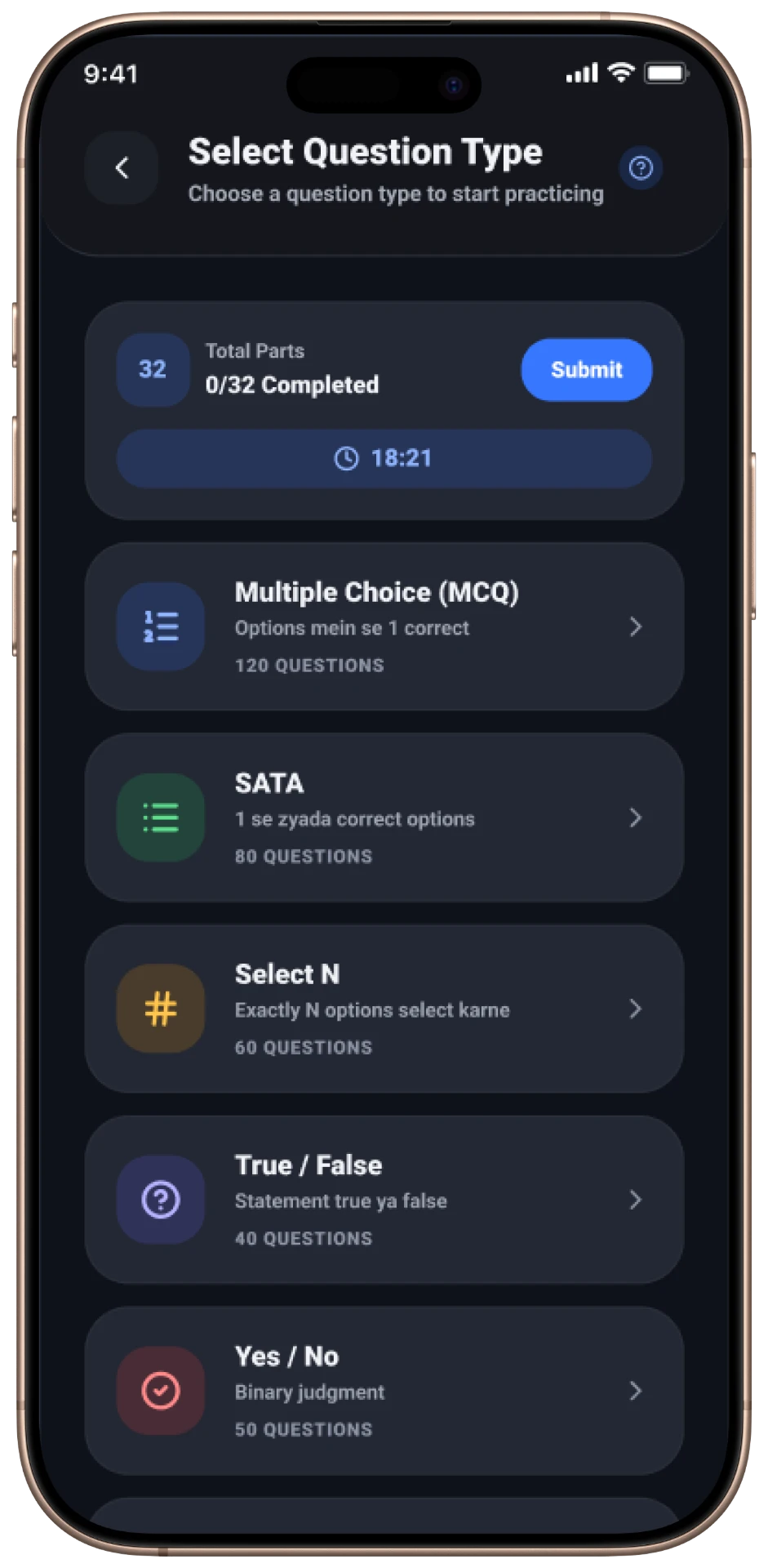
- Select Question Type
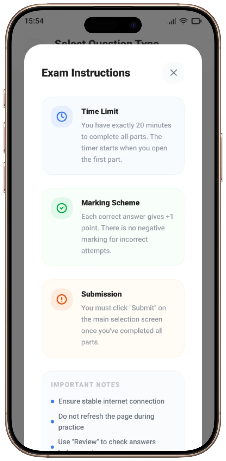
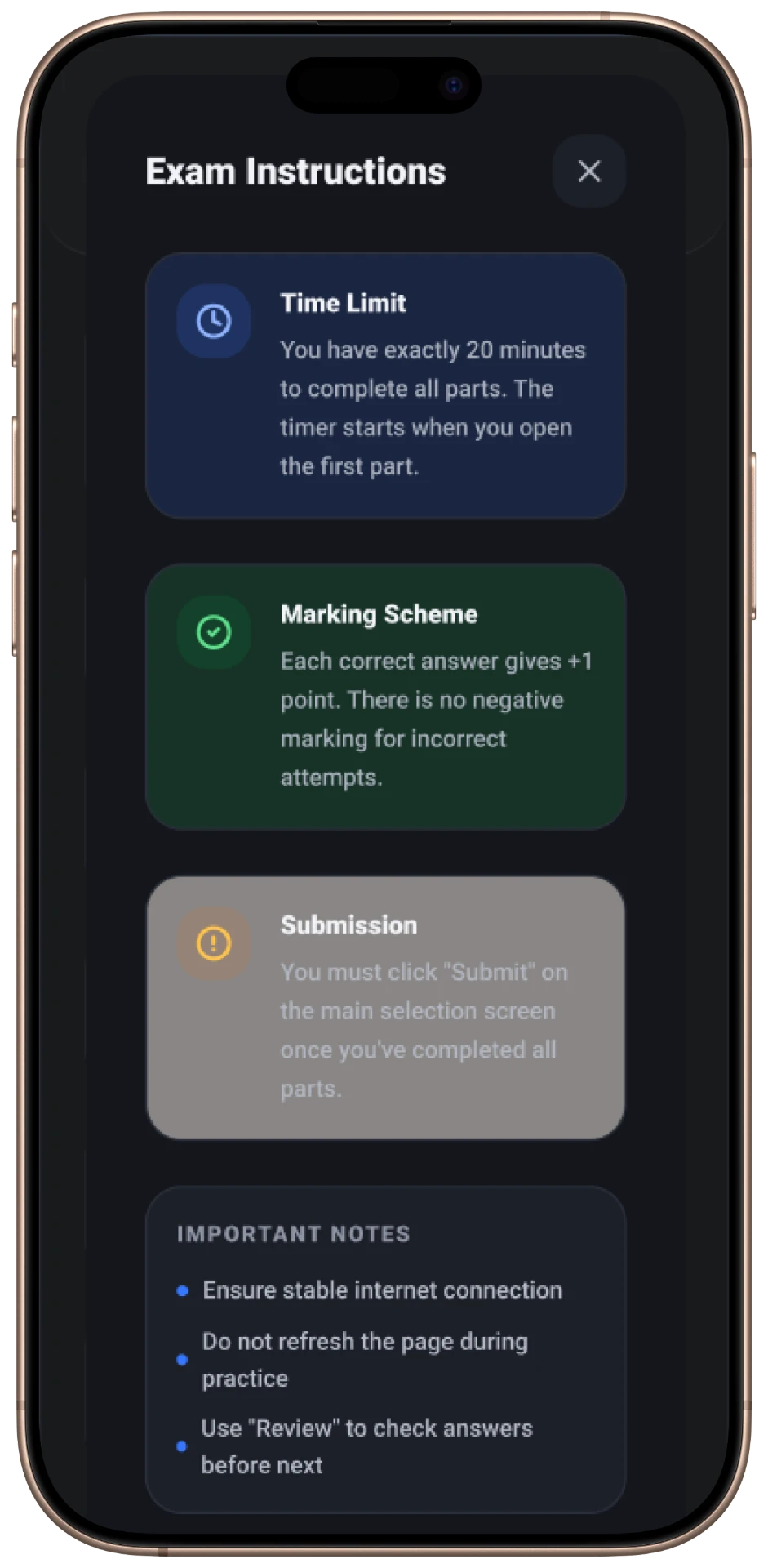
- Exam Instructions
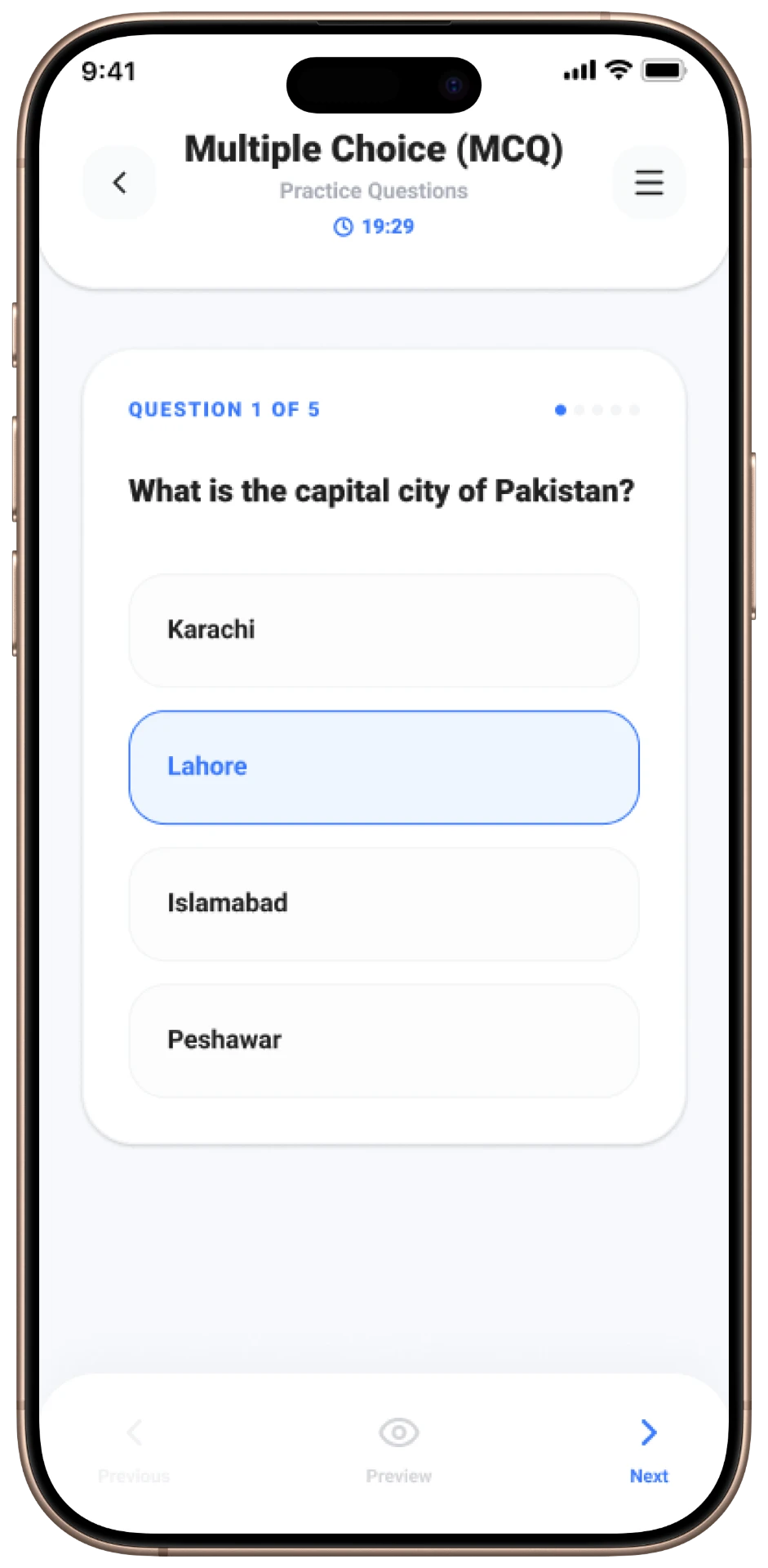
- MCQ Practice
- Solution Review
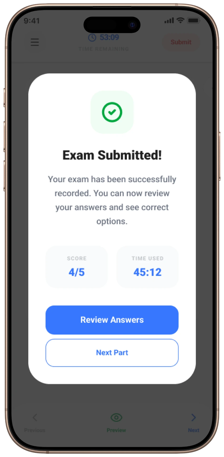
- Exam Submission
From Wireframes to Final UI
Wireframes explored the transition from a broad dashboard to specific exam environments, ensuring consistent header actions.
Low Fidelity
Structure first
Grey-box layouts to settle hierarchy, navigation and the order of information before any styling.
High Fidelity
Final UI
Typography, colour, components and states applied on top of the approved structure.
UI Design
Mobile Applications
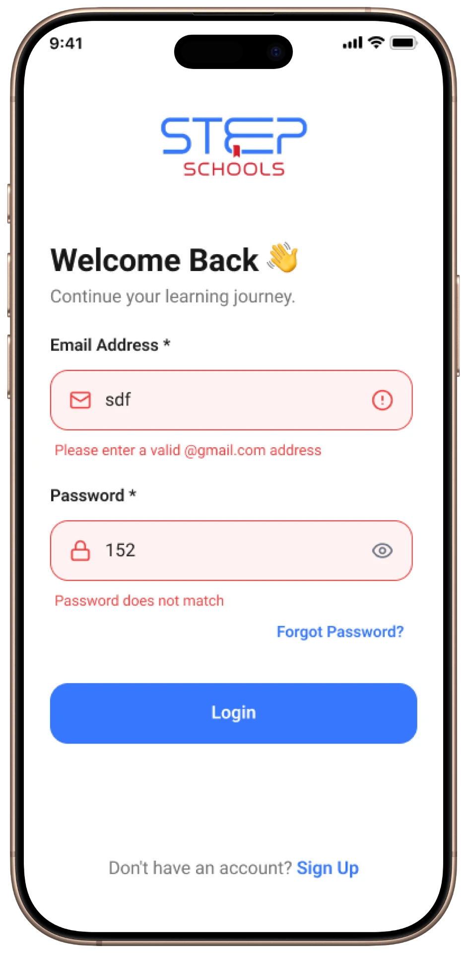
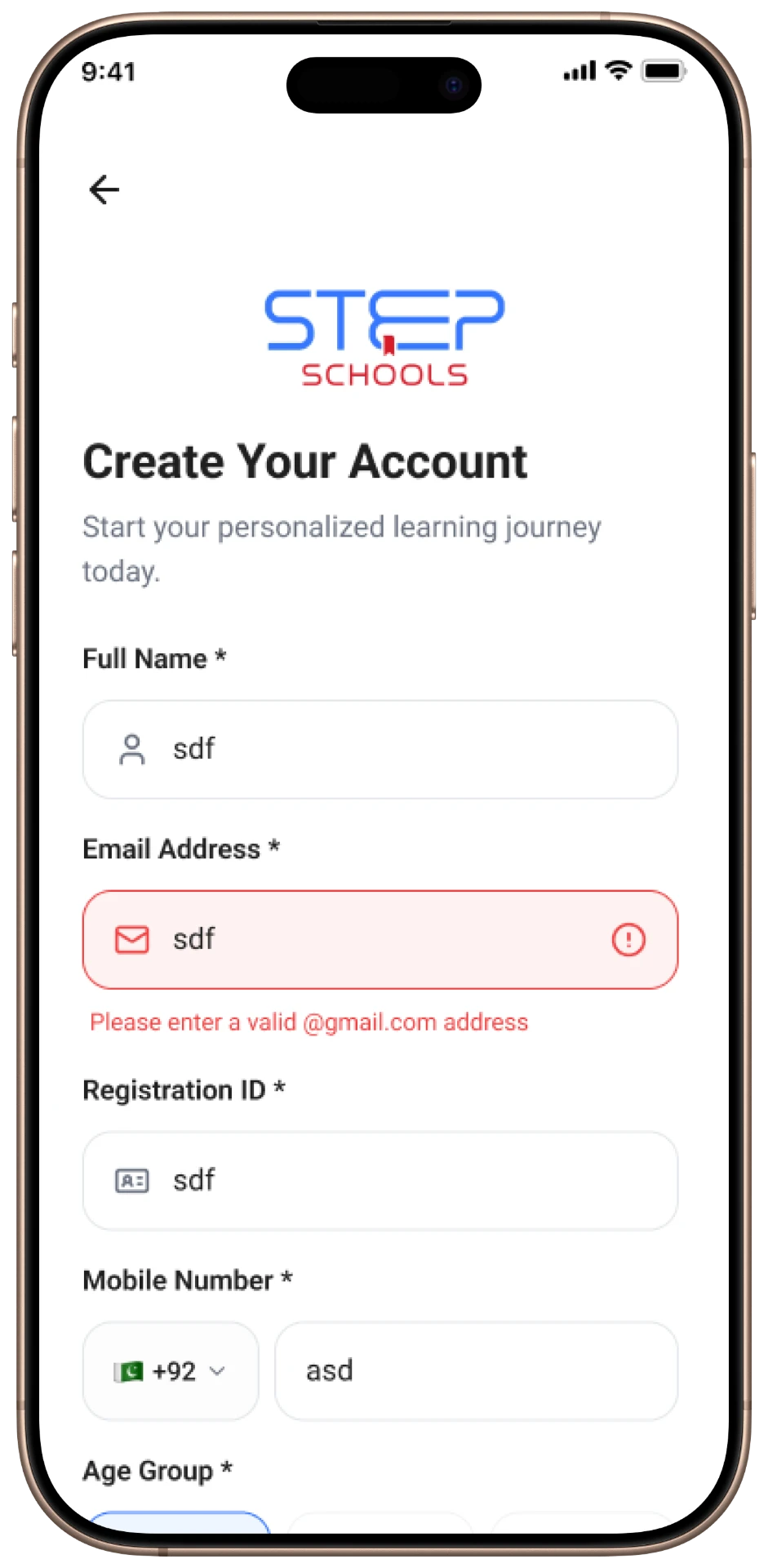
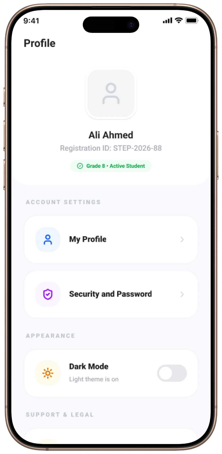
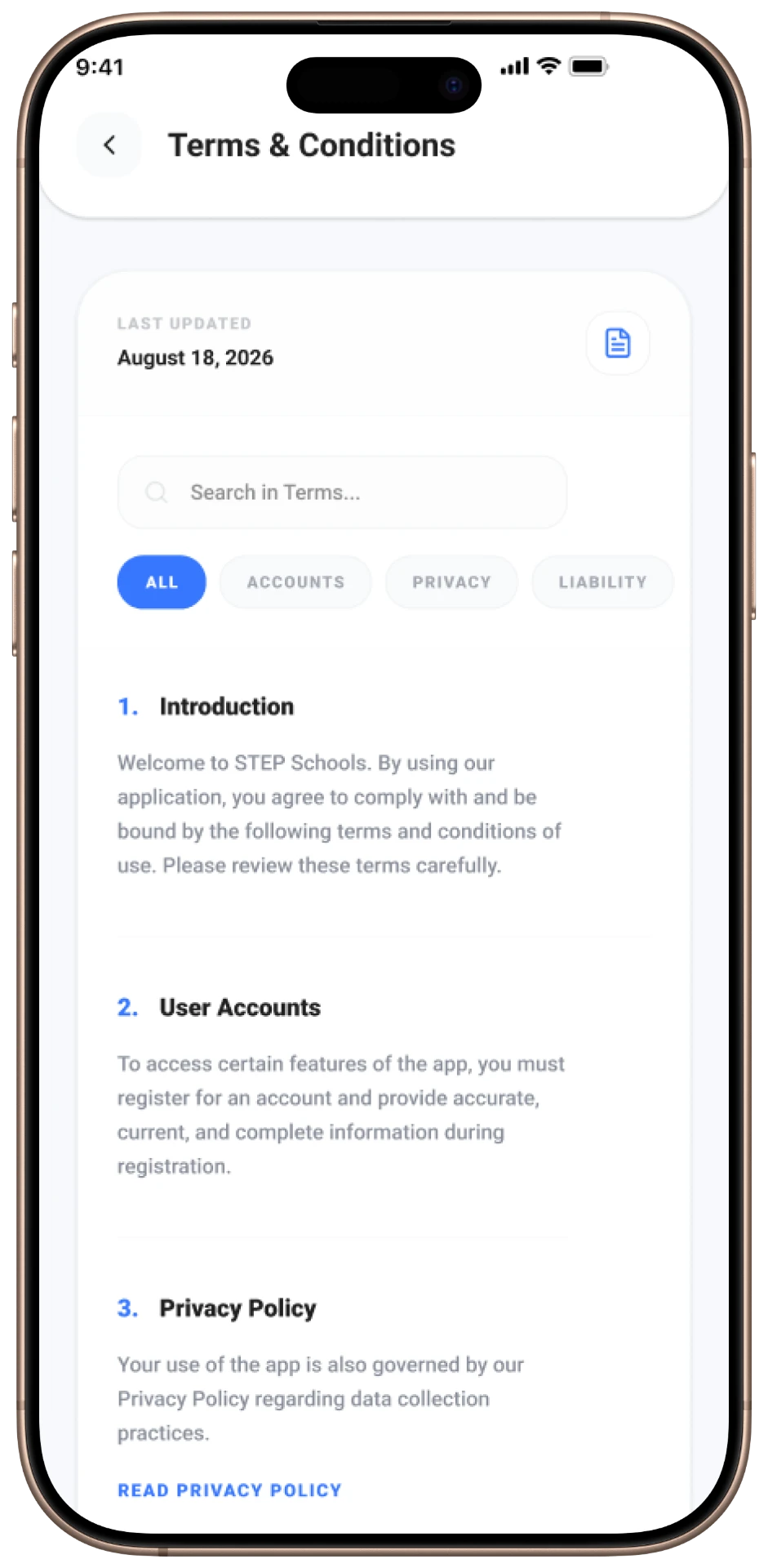
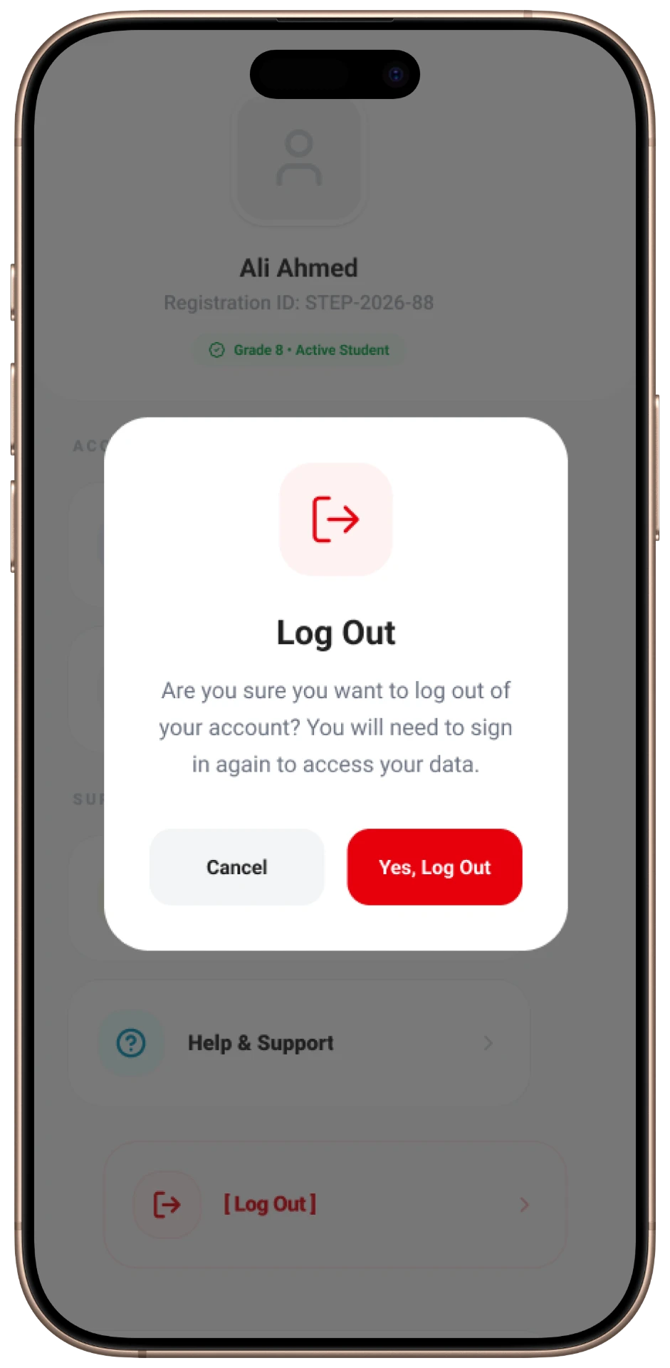
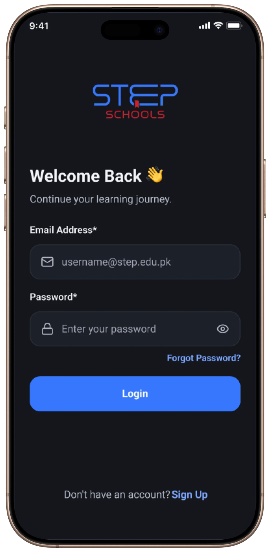
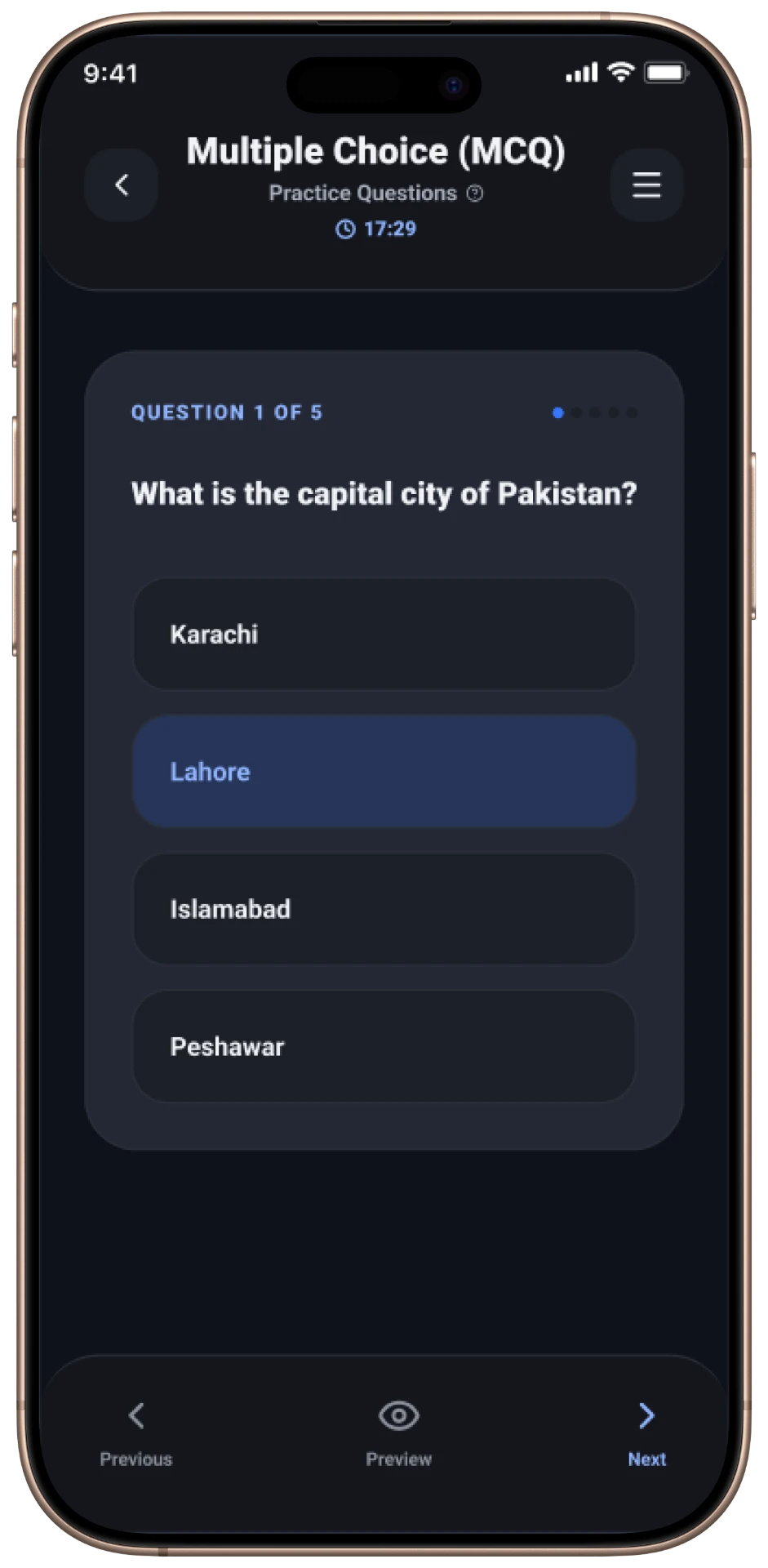
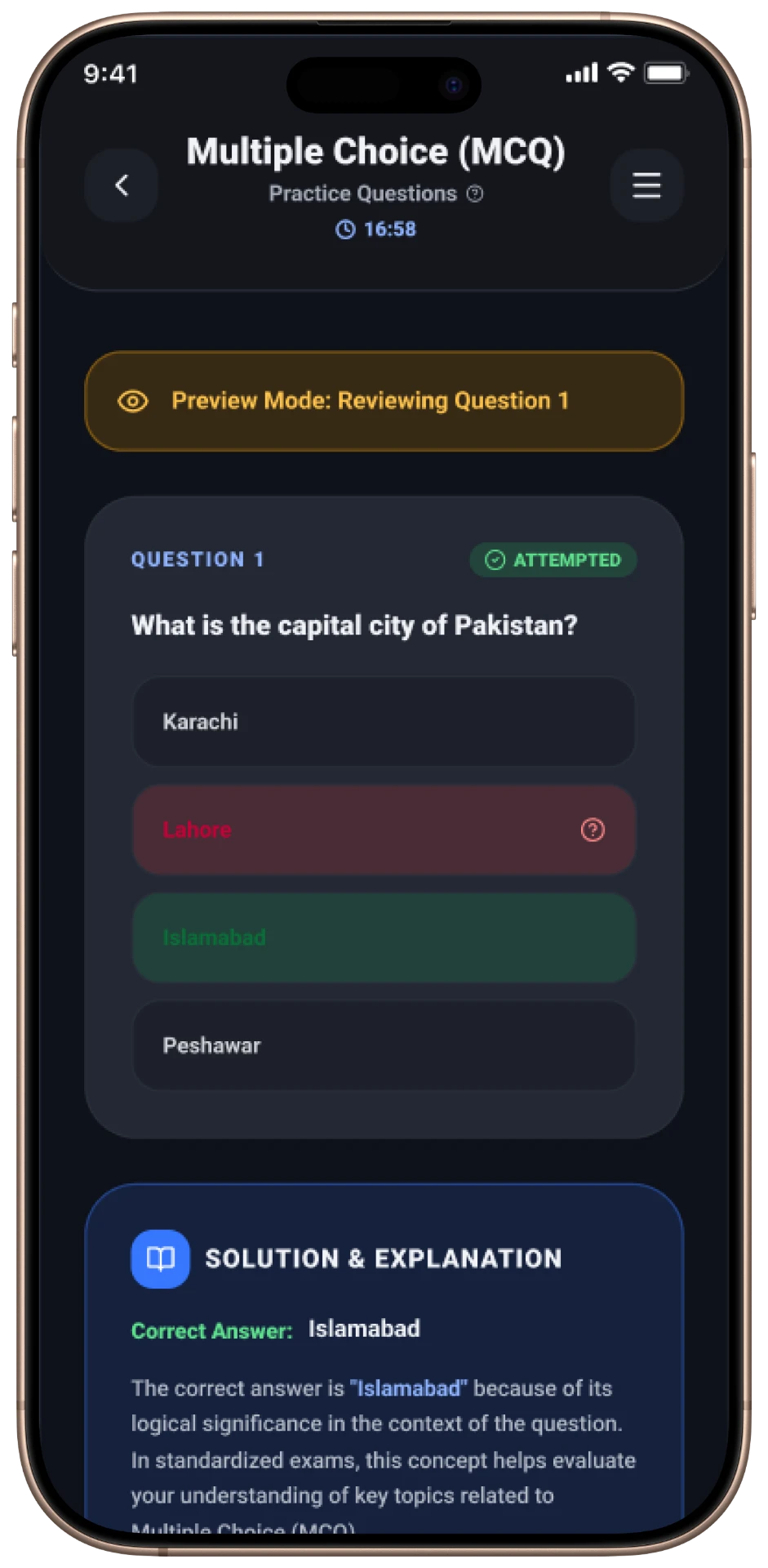
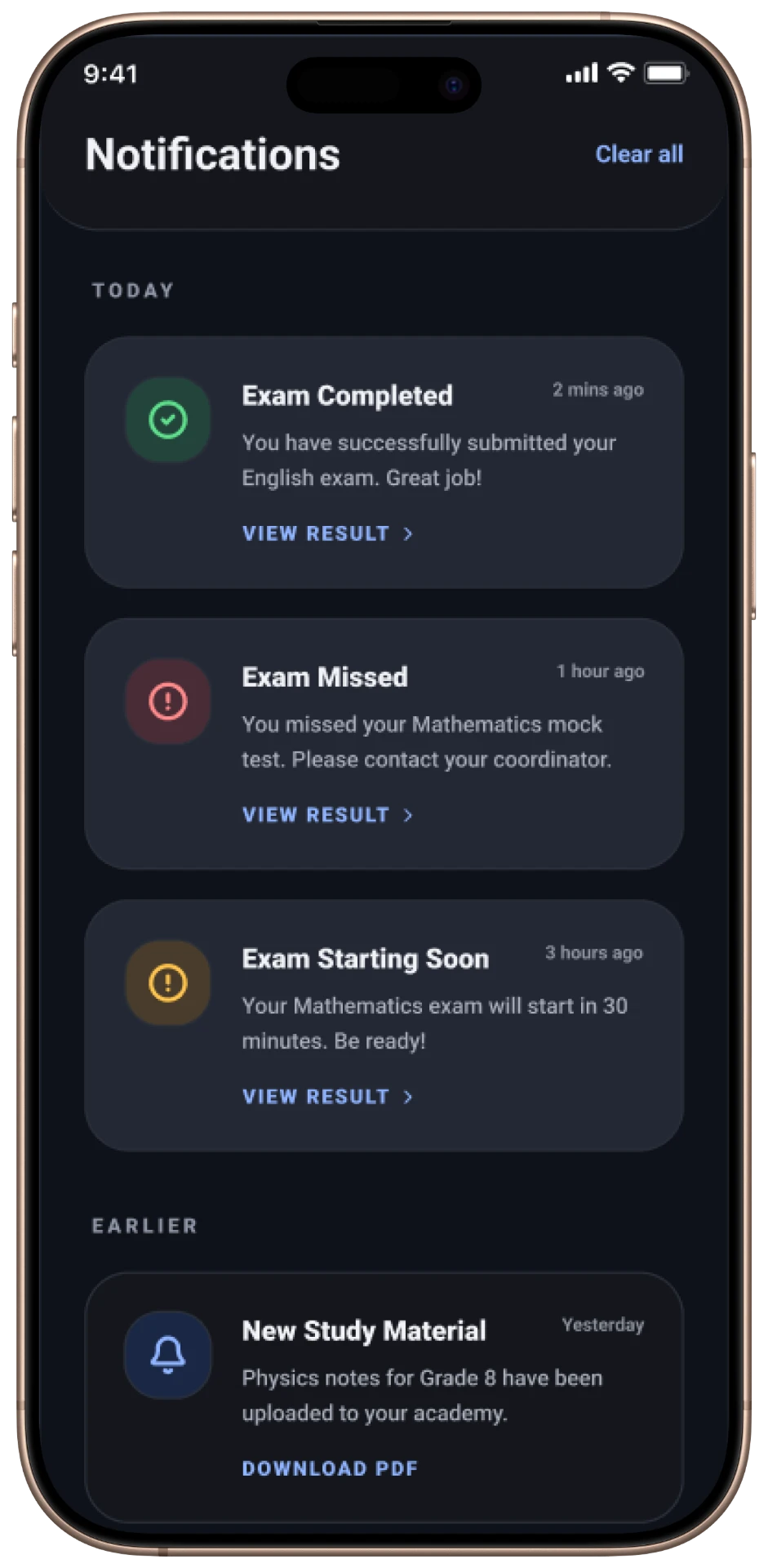
Native Android and iOS screens carrying the same experience to users on the move.
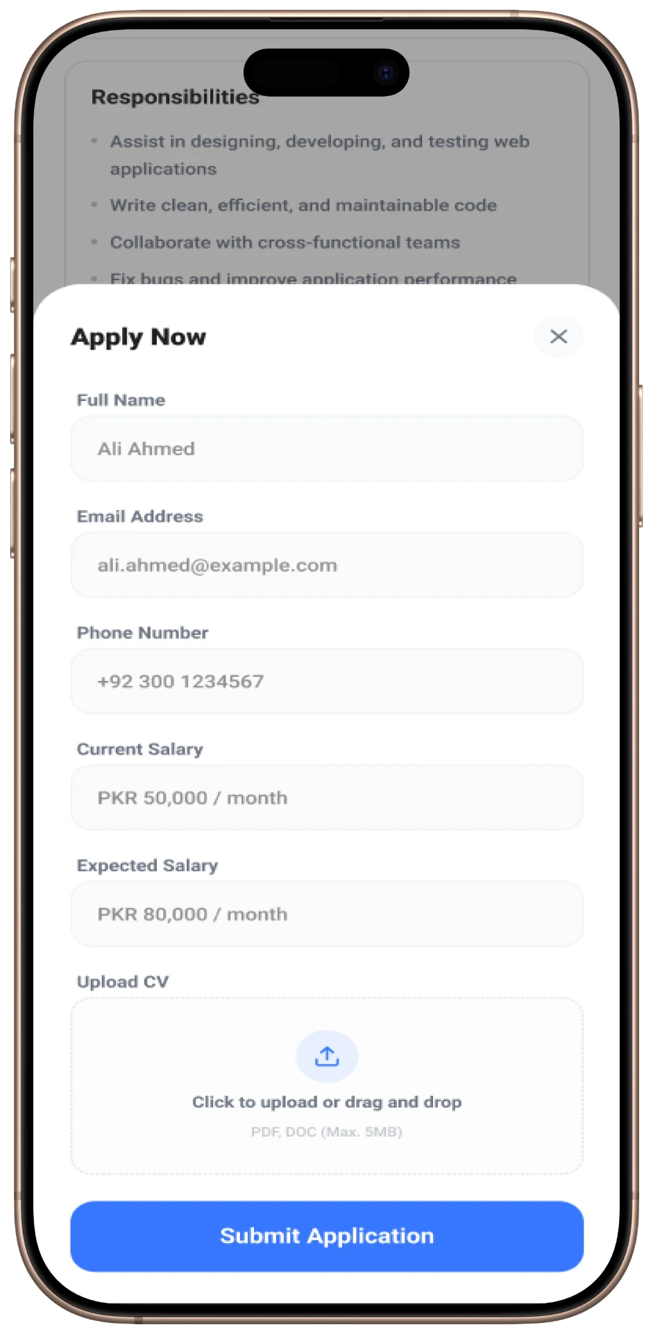
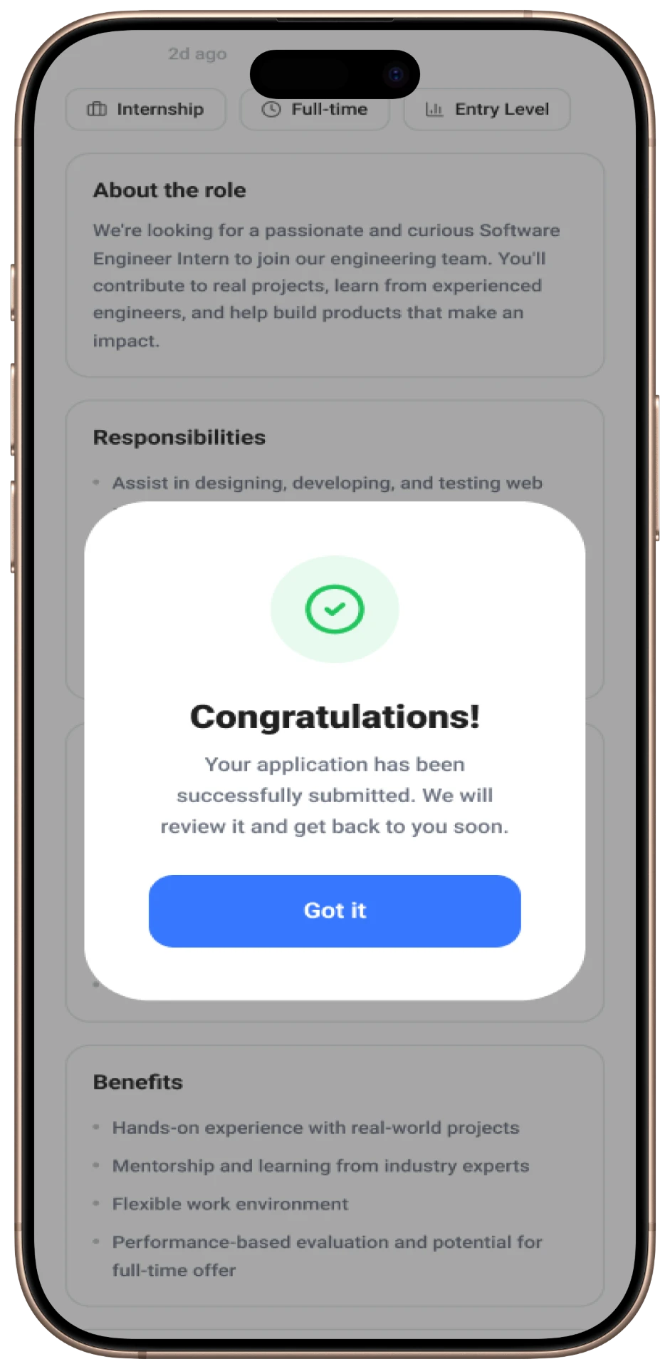
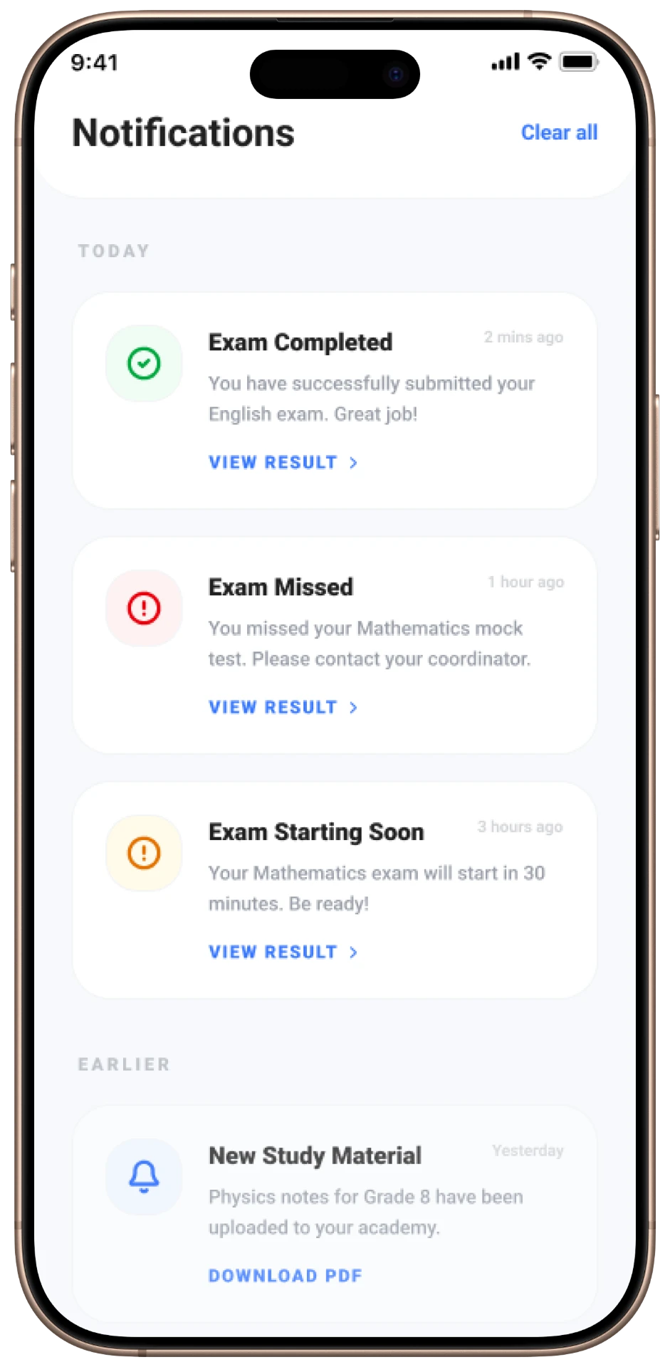
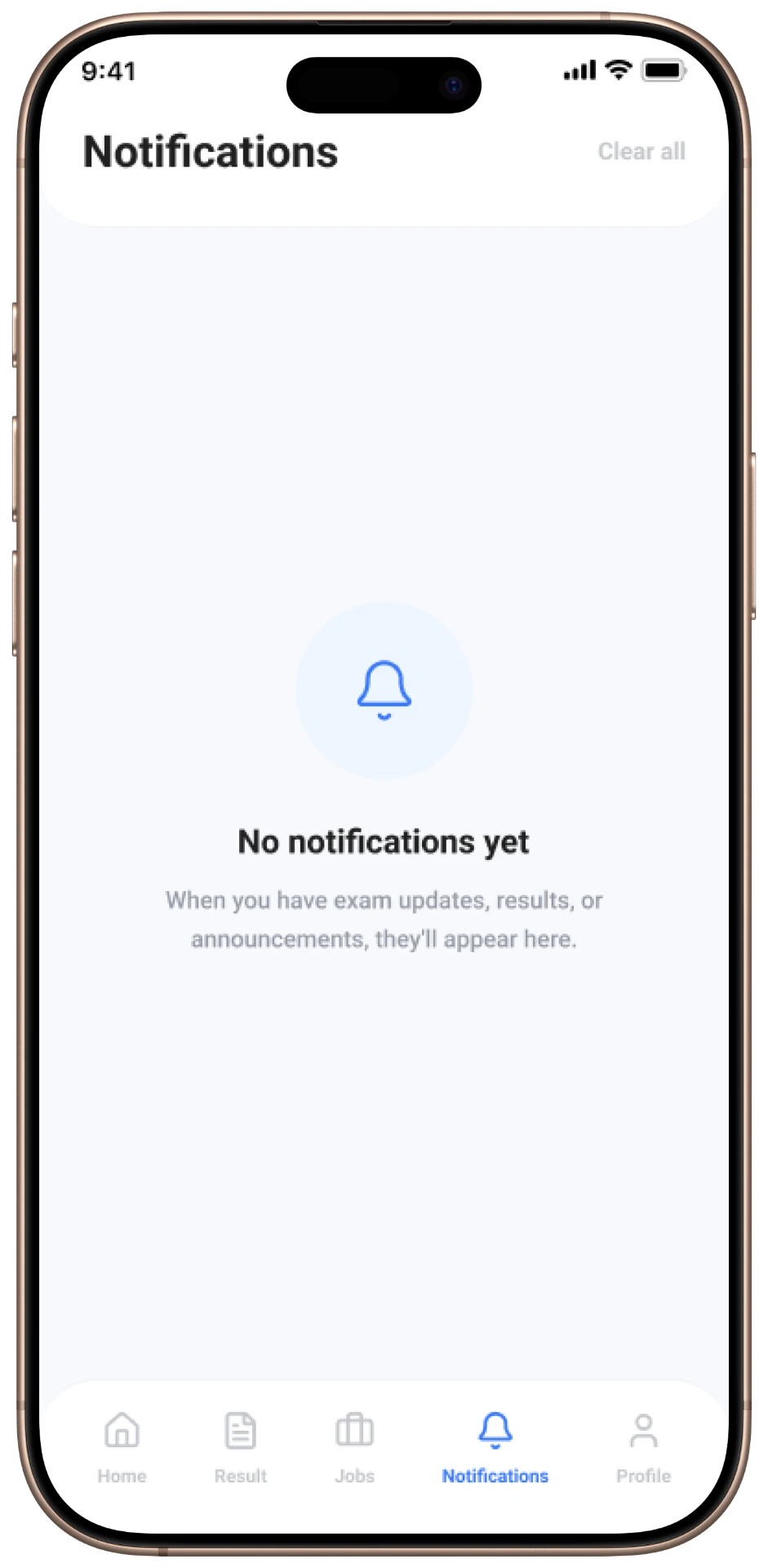
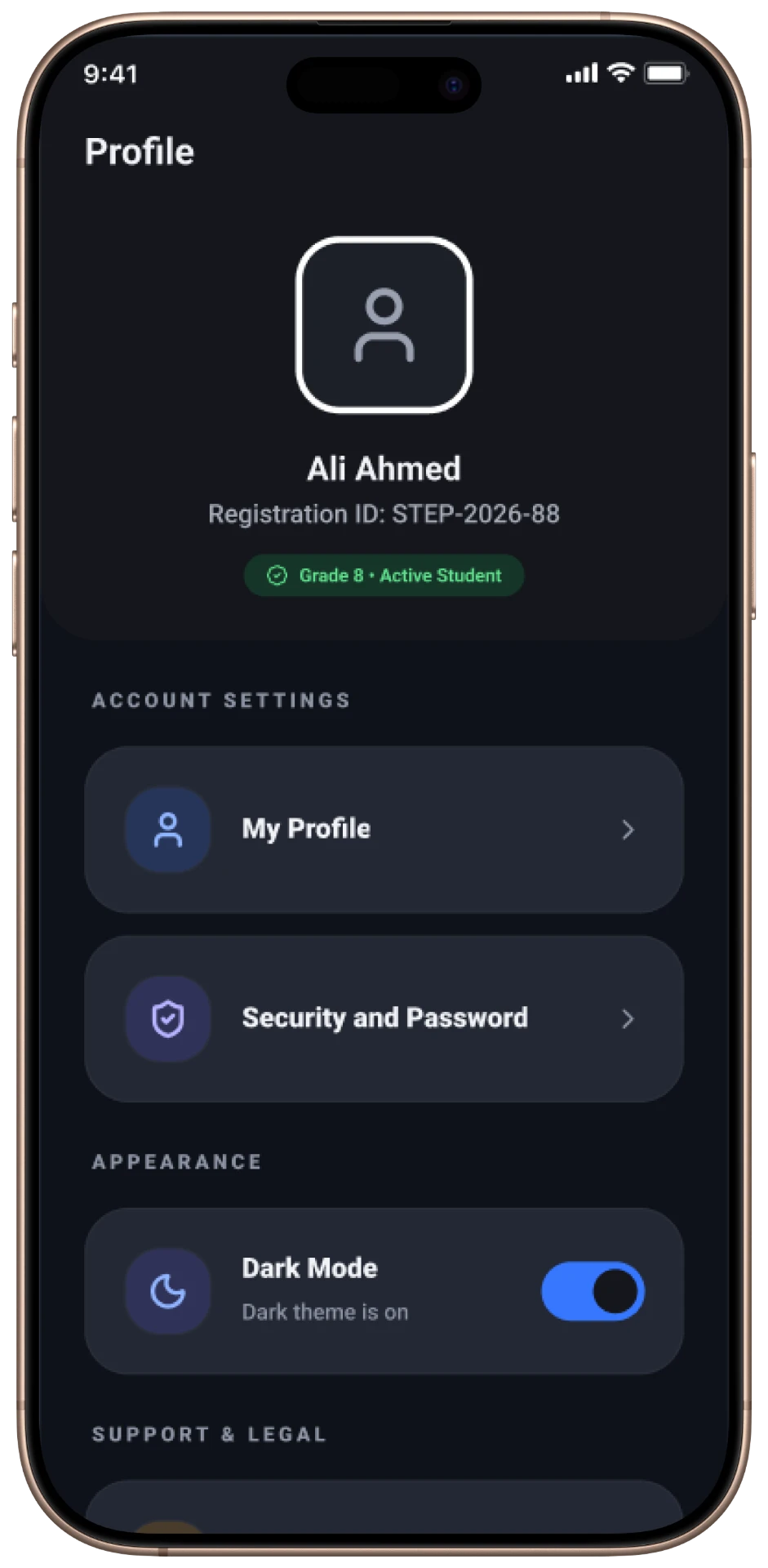
Building a Scalable Design System
A light, high-contrast mobile system with a full dark-mode counterpart built from the same tokens.
Colour
- Brand blue primary
- Correct / wrong / attempted states
- Light and dark surface pairs
Typography
- Large question type
- Compact meta labels
- Result number display
Components
- Question card
- Option row with states
- Timer header
- Result summary card
- Job card
- Notification row
Patterns
- Consistent header actions
- Rounded card rhythm
- Dark-mode parity
- Bottom navigation
Key Design Decisions
01Instructions Before Every Exam
A dedicated instructions screen sets rules and timing up front, lowering exam anxiety.
02Feedback Inside Practice
Solution and explanation blocks appear in the practice flow so students learn while attempting.
03State-coded Review
Colour and icon pairs distinguish attempted, correct and wrong answers without reading labels.
Outcome
The redesigned experience made exam rules clear before every attempt, added feedback inside practice, and gave students an unambiguous way to review performance across both light and dark modes.
What I Learned
Designing an assessment flow taught me how strongly clarity affects confidence. Explaining the rules and showing feedback immediately changed the experience more than any visual refinement.
Interactive Prototype
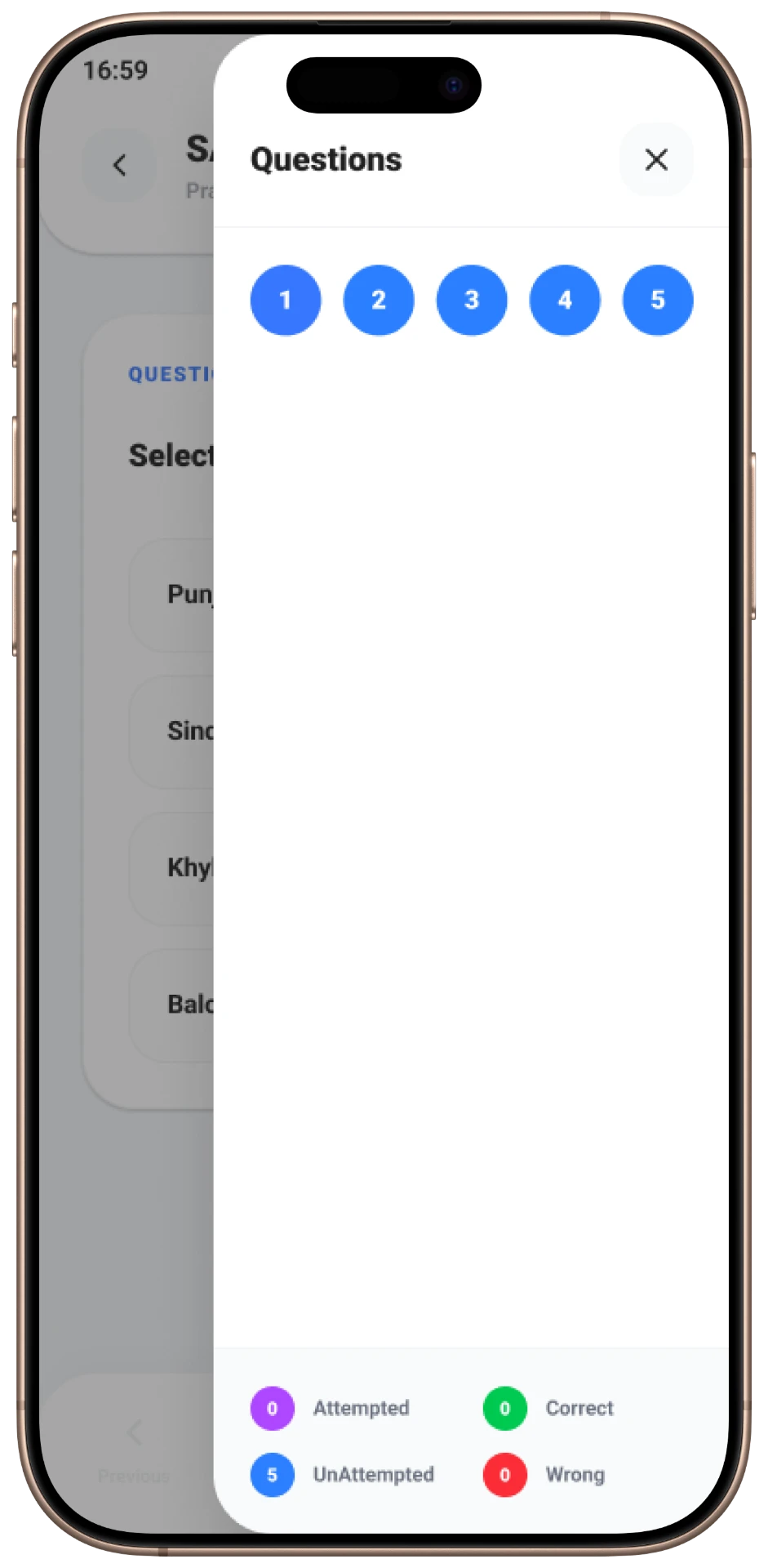
A high-fidelity prototype was used to validate the exam timer, navigation between questions, and the display of solution explanations.
Explore the final experienceView Prototype