Luxury E-commerce Website
AAZEA
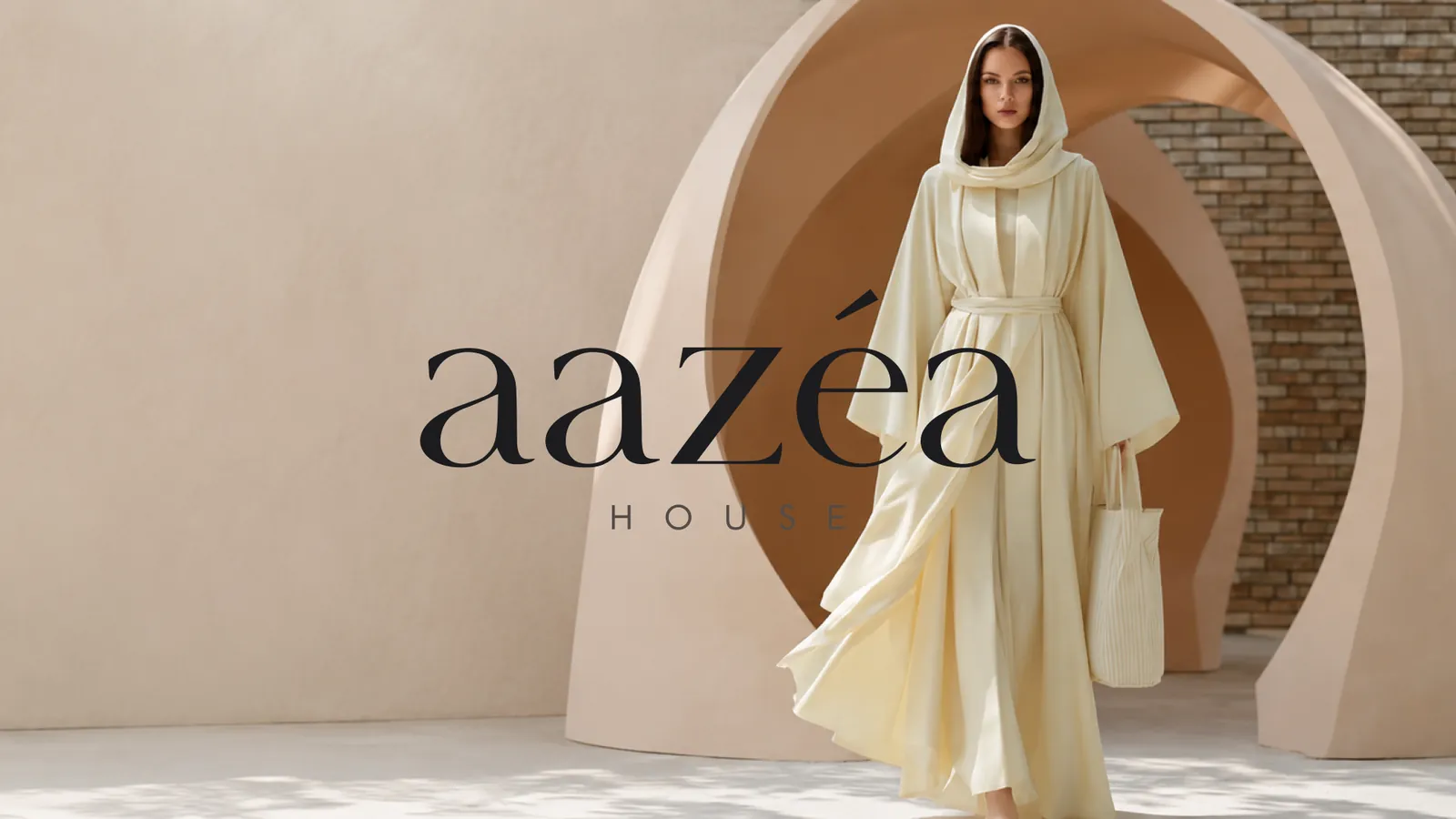
A luxury abaya e-commerce experience for AAZEA House — editorial storefront, refined product discovery and a calm two-step checkout.
Project Overview
AAZEA House is a Dubai-based modern abaya and wardrobe-essentials label. I designed the full storefront — home, shop, product detail, account and checkout — around an editorial, quietly luxurious identity: serif display type, sand and deep-taupe neutrals, and full-bleed campaign imagery.
- Role
- UI/UX Designer
- Timeline
- 3 Weeks
- Platform
- Responsive Website
- Industry
- Fashion / Modest Wear
- Tools
- Figma, Wireframing, Design Systems
The Problem
Premium modest-wear shoppers need fabric, fit and sizing confidence before buying, but catalogue layouts bury that detail and stretch checkout across too many steps.
- Sizing and fit answers hidden below the fold
- Fabric and care detail missing at the decision moment
- Checkout spread across five separate steps
- Generic catalogue styling undercut the brand's price band
Project Goals
Make elegance feel effortless: let each piece breathe visually while surfacing fabric, size and delivery facts early, and close the sale in one uninterrupted checkout screen.
- 01
Let each piece breathe visually as an editorial brand would
- 02
Surface fabric, size and delivery facts before add-to-cart
- 03
Close the sale on one uninterrupted checkout screen
- 04
Build a reusable editorial component set across all pages
Research & Discovery
- Sizing (52–62) and model-height reference were the top questions before adding to cart
- Fabric and care detail drove confidence more than discounts for this price band
- AED currency, UAE address fields and Apple/Google Pay were expected as defaults
User Flow
- Home
- Collections
- Shop / Filters
- Product detail
- Size guide
- Account or guest
- Checkout
- Order confirmation
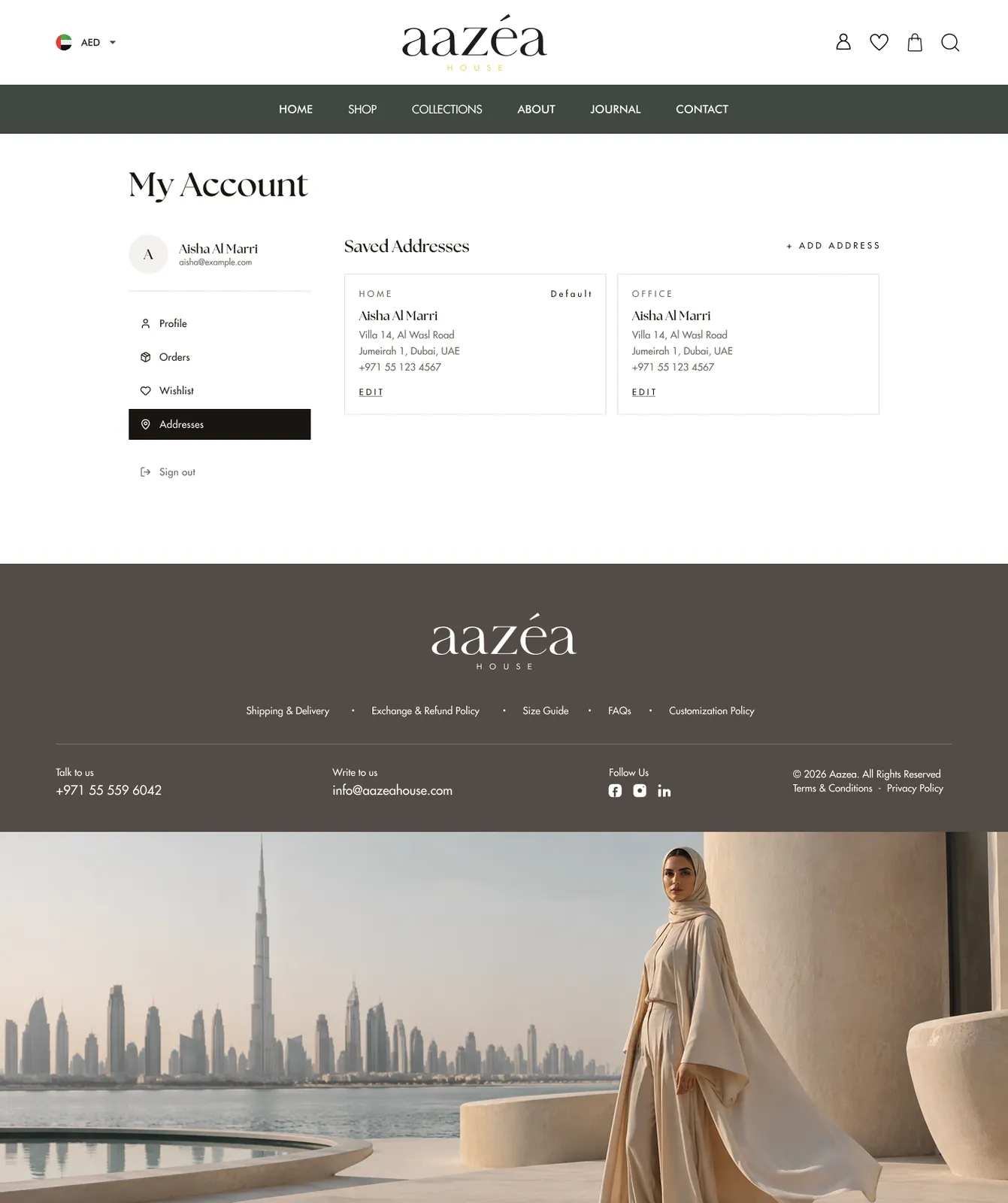
- My Account
From Wireframes to Final UI
Wireframes tested a left filter rail against a top filter bar, sticky add-to-cart on product detail, and a single-page checkout with a persistent order summary on the right.
Low Fidelity
Structure first
Grey-box layouts to settle hierarchy, navigation and the order of information before any styling.
High Fidelity
Final UI
Typography, colour, components and states applied on top of the approved structure.
UI Design
Website
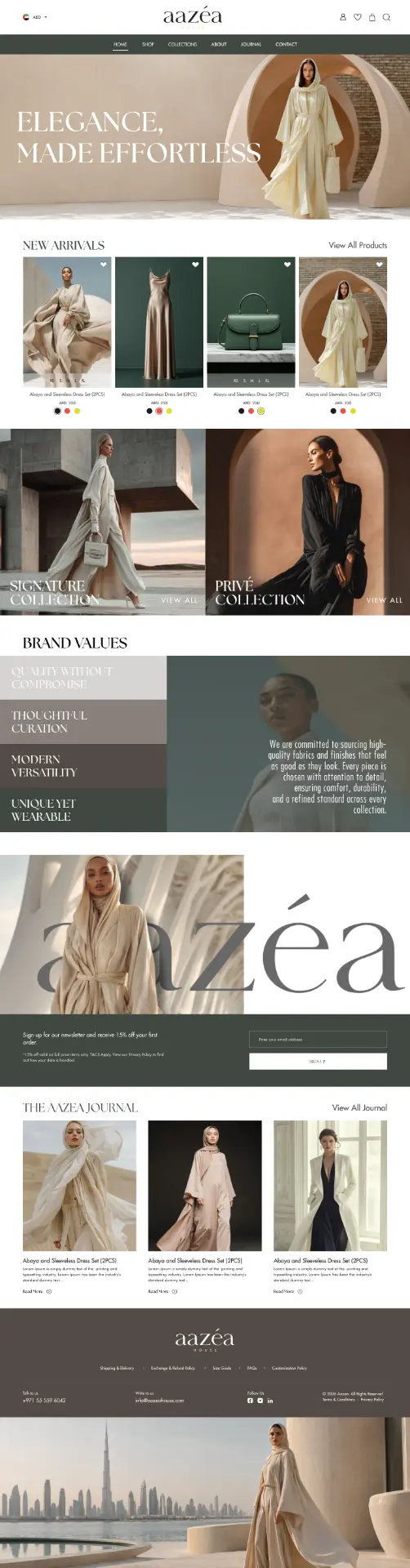
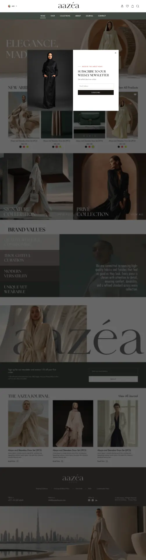
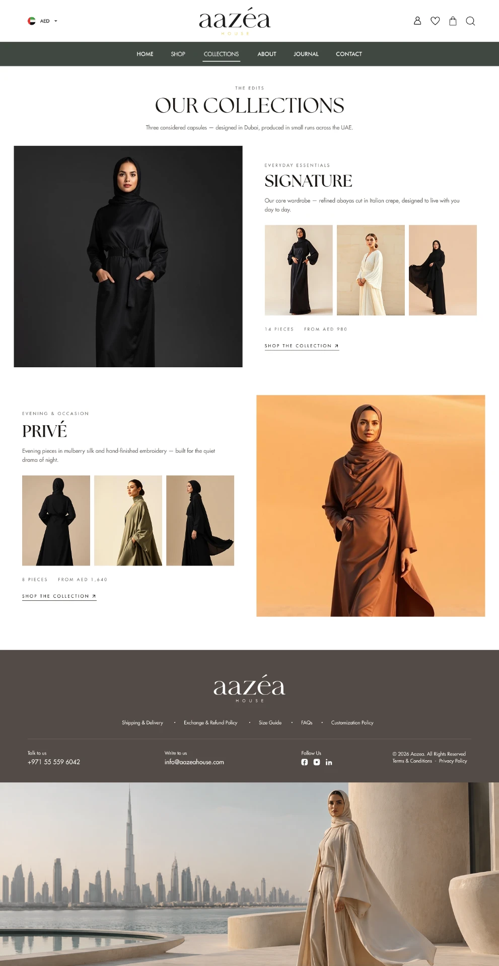
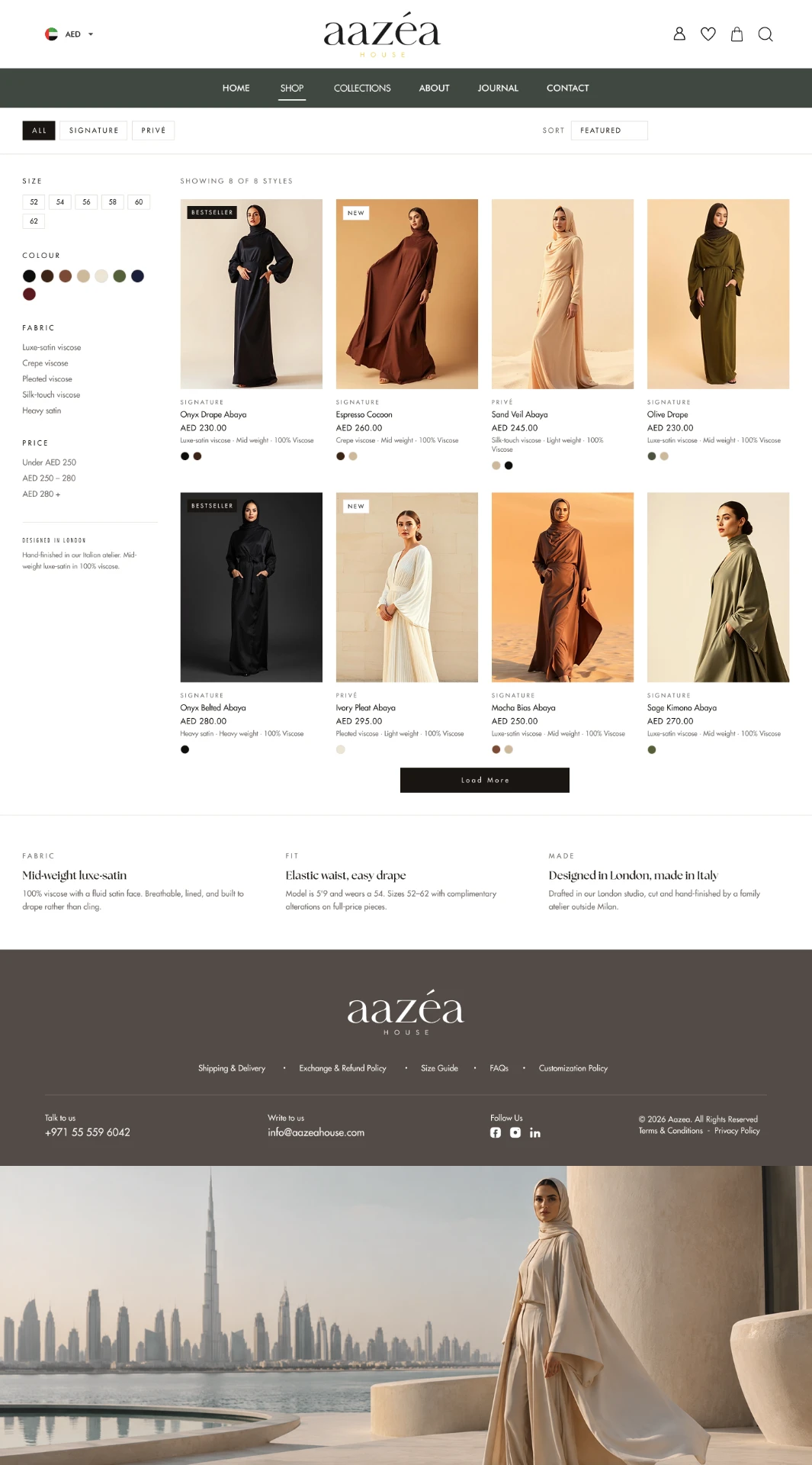
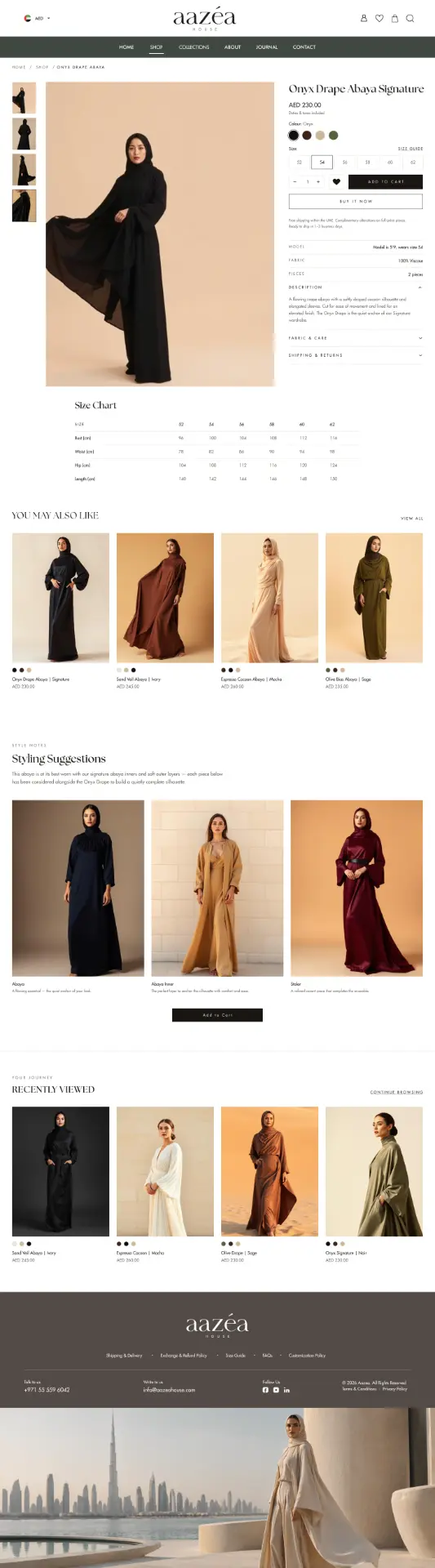
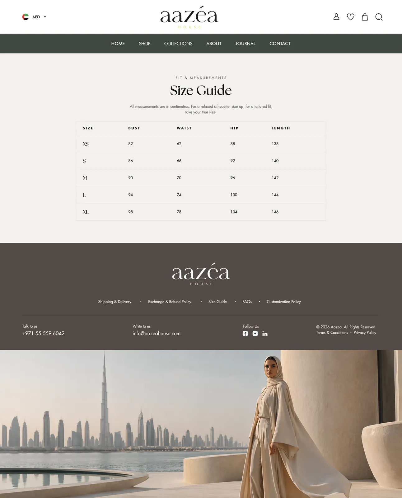
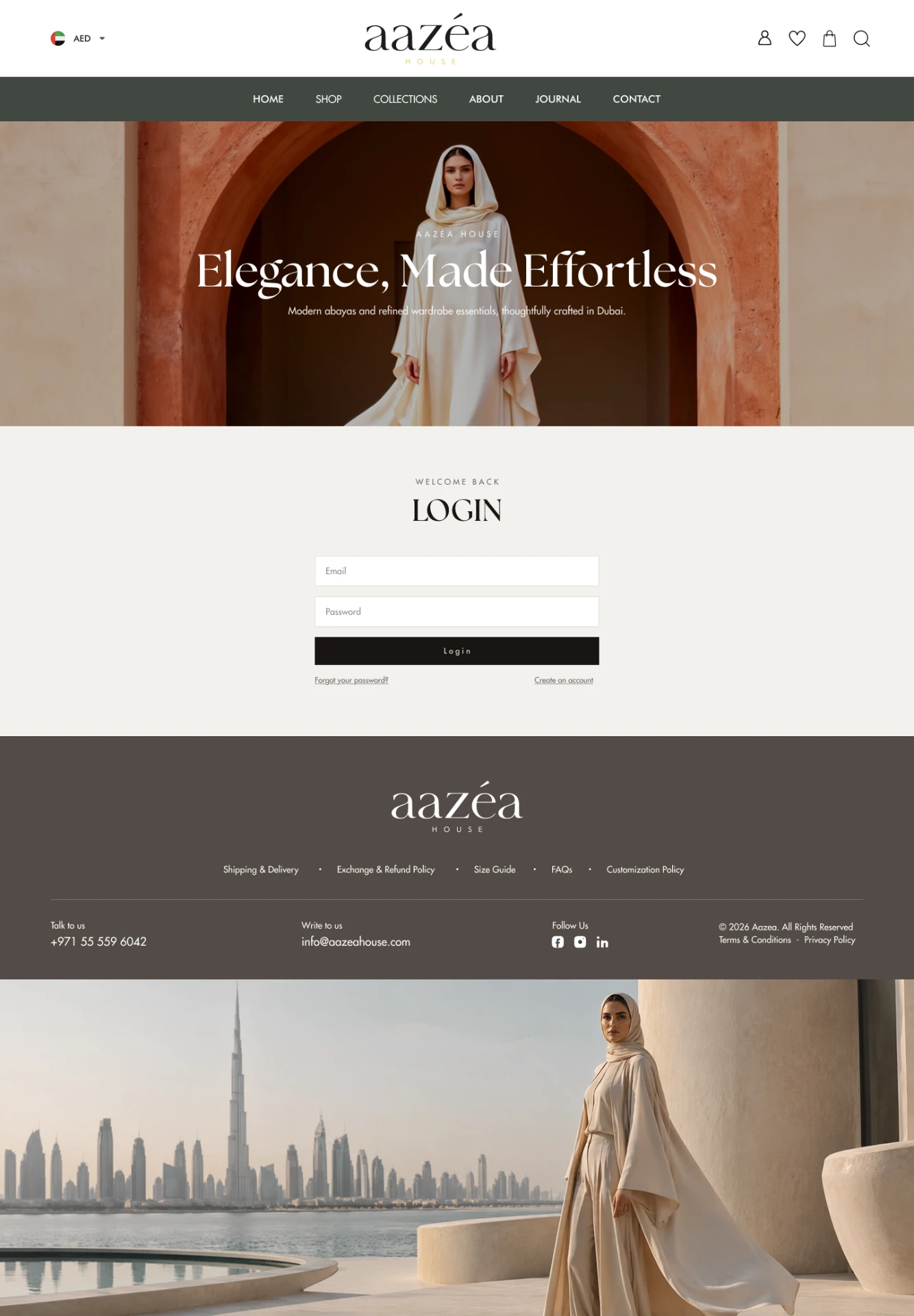
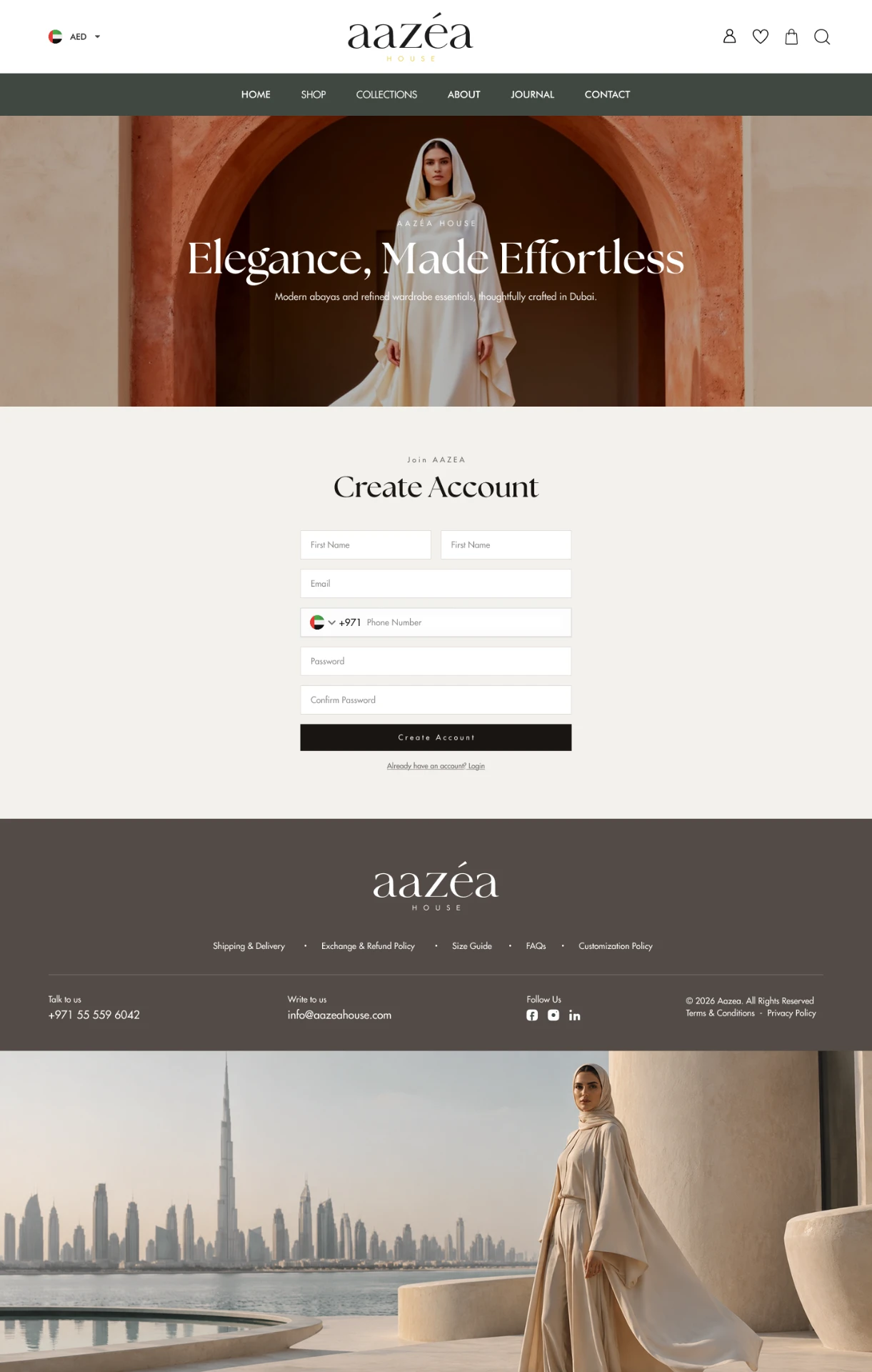
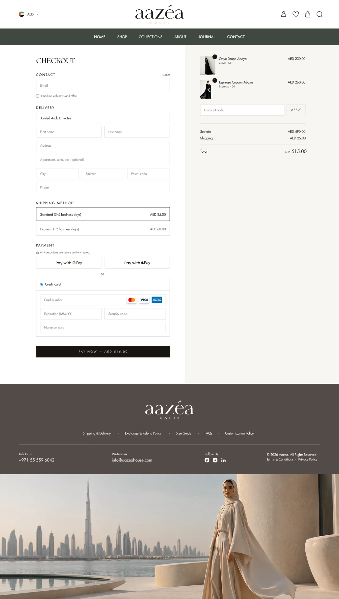
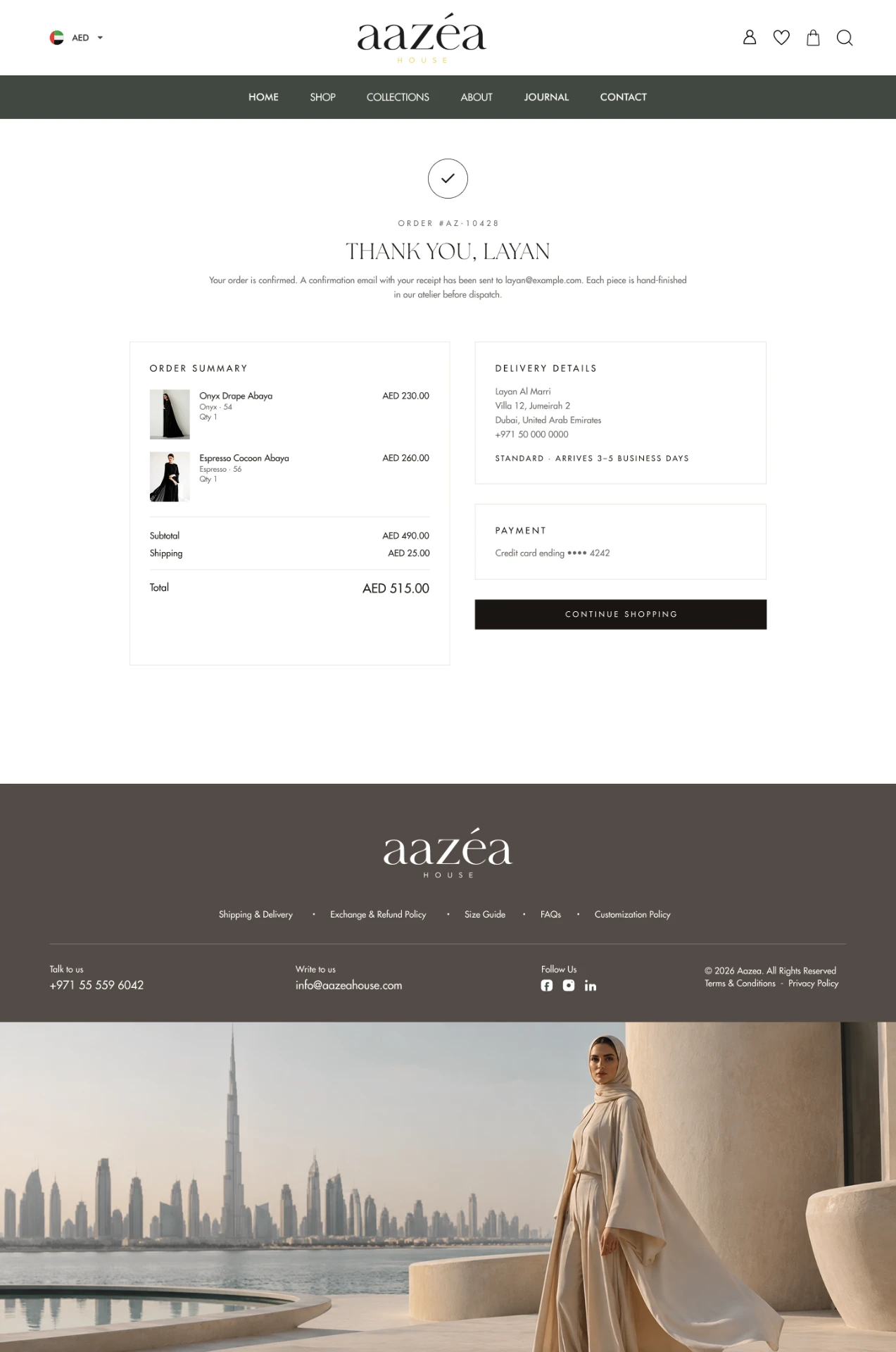
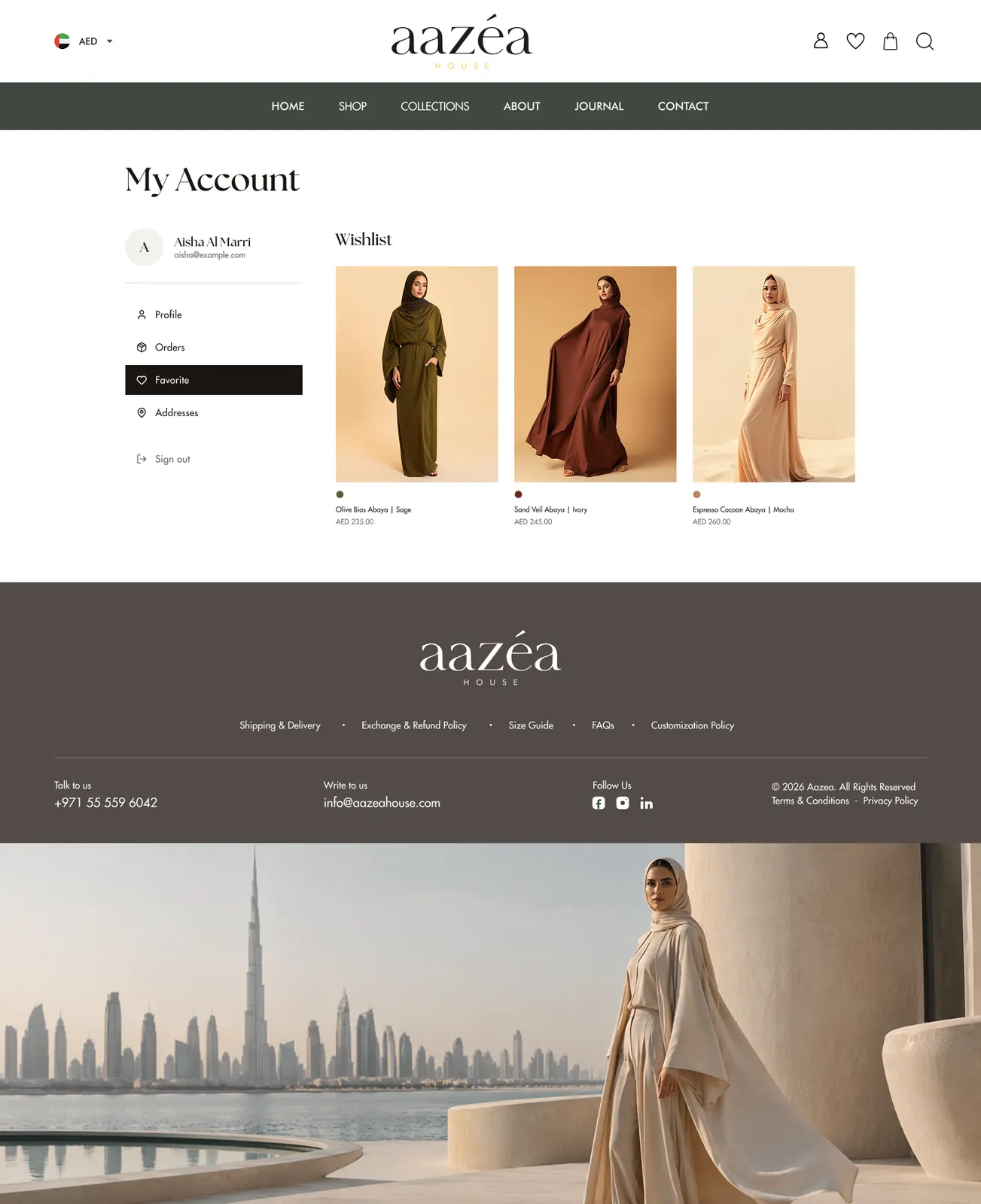
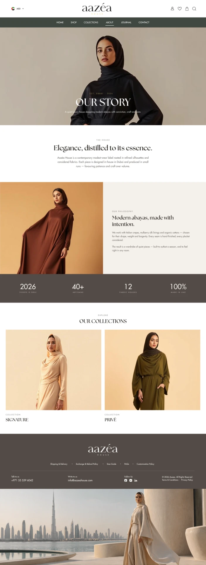
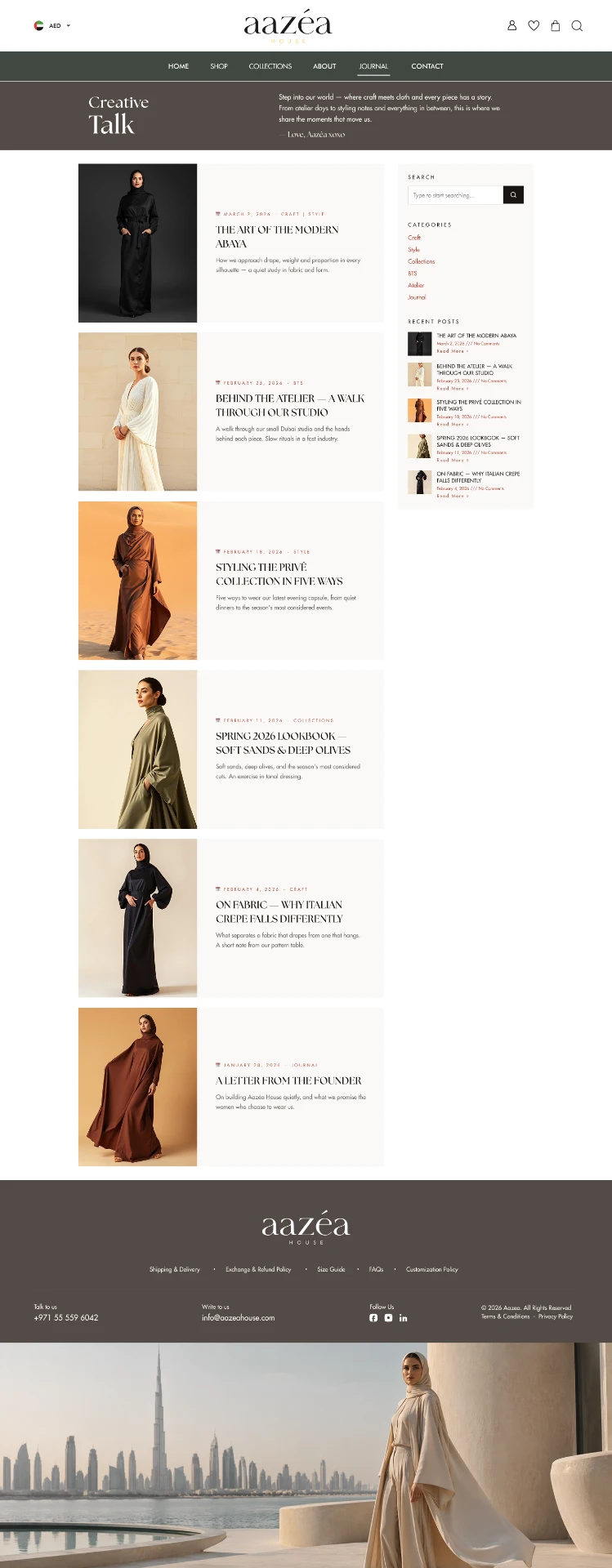
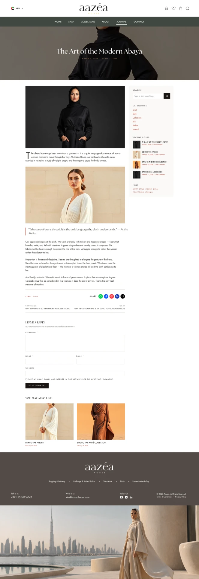
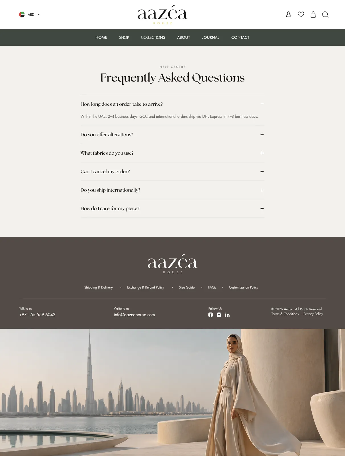
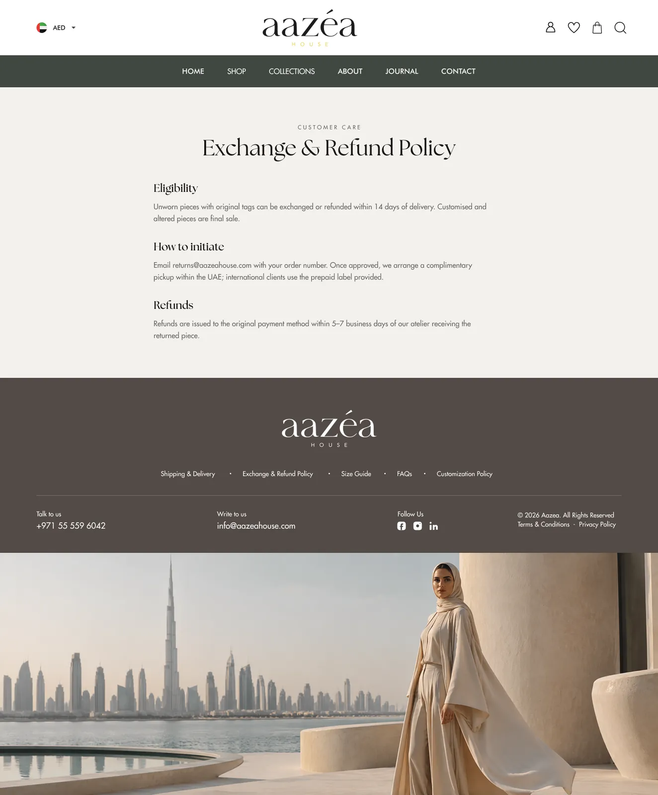
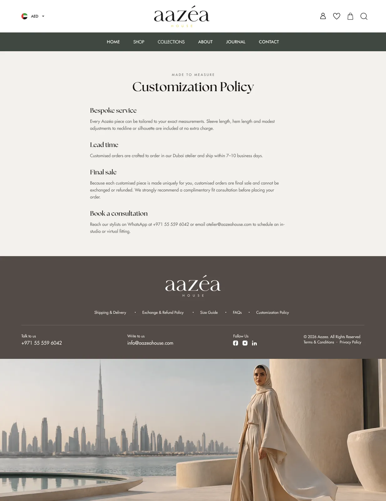
An editorial system: Aazéa serif logotype, deep-taupe navigation band, off-white surfaces, warm sand product backgrounds and a single near-black accent reserved for primary actions. Size chart, fabric and care live in quiet accordions so imagery stays the hero.
Building a Scalable Design System
An editorial system where imagery leads and interface elements stay quiet.
Colour
- Deep taupe navigation
- Off-white surfaces
- Warm sand product backgrounds
- Near-black primary action
Typography
- Serif display logotype and headings
- Clean sans body
- Wide-tracked labels
Components
- Product card with swatches
- Size chart accordion
- Sticky add-to-cart
- Order summary
- Journal card
- FAQ accordion
Layout
- Full-bleed campaign blocks
- Filter rail
- Single-page checkout
- Generous whitespace
Key Design Decisions
01Single-screen Checkout
Contact, delivery, shipping and payment collapse into one screen with a live order summary.
02Quiet Accordions
Fabric, care and sizing live in accordions so imagery stays the hero without hiding facts.
03One Accent Colour
A single near-black accent reserved for primary actions keeps the palette editorial.
Outcome
Checkout collapsed from five steps to one screen, product pages answer fabric and sizing questions without leaving the page, and the storefront reads as a fashion house rather than a generic catalogue.
What I Learned
This project sharpened my sense of restraint. Removing interface noise and reserving a single accent made the storefront read as a fashion house rather than a catalogue.
Interactive Prototype
Prototyped the full purchase journey in order — discovery, collection entry, filtered browsing, size selection, guest and account checkout, confirmation and account management — across desktop and mobile breakpoints.
Explore the final experienceView Prototype